6 Graphics
Statistical graphs can offer very effective means for formally presenting the findings from a data analysis or simulation study. They are also an essential part of exploratory data analysis. There are two models for creating statistical graphs in R: the painter’s model provided by functions in base R, and the Grammar of Graphics object-based model that has been implemented in the ggplot2 package using the grid graphics approach of the grid package.
In this chapter, we describe and demonstrate each approach through examples. However, since these two models are quite different, we encourage the beginner to focus on one method at first.
This chapter also provides a brief overview of the basic plot types available in R. For all of the examples, we use one set of data that includes a range of variables and data types. In addition to introducing some of the basic plots, we include examples of how to add content and modify features of the graphs. R’s plotting tools are flexible, and we barely touch on the multitude of possibilities for customizing and designing your own visualizations. We refer you to the many online resources that are available to learn more about the visualization tools in R.
6.1 Kaiser Infant Health Data
We use data from the Child Health and Development Studies (CHDS) to demonstrate the plotting features in R (CHDS is described in Section 5.1). The babies data frame that we use in this chapter contains a subset of the information collected for 1236 babies–baby boys born during one year of the study who lived at least 28 days and were single births (i.e., not one of a twin or triplet). The information available for each baby, is provided in the table below.
| Variable | Definition |
|---|---|
| id | identification number |
| date | birth date |
| gestation | length of pregnancy in days |
| bwt | birth weight in ounces |
| parity | number of previous pregnancies |
| race | mother’s race |
| age | mother age in years |
| ed | mother education |
| ht | mother height to last completed inch |
| wt | mother pre-pregnancy wt in pounds |
| drace | father race |
| dage | father age in years |
| ded | father education |
| dht | father height to last completed inch |
| dwt | father wt in pounds |
| marital | marital status |
| inc | family yearly income |
| smoke | mother smoking status |
| time | how long ago? |
| number | number of cigarettes smoked per day |
We have prepared these data for analysis by, e.g., converting values of 99 and 999 into NAs, formatting variables such as smoking status and education as factors, and collapsing categories with only a few observations.
load("data/babies.Rda")6.2 Painter’s Model in Base R
The graphics functionality in base R creates a statistical graph from a high-level function, such as plot(). There are many functions in base R for making different kinds of plots, including hist(), plot(), boxplot(), dotchart(), barchart(), and mosaicplot() to make, respectively, a histogram, scatter plot, box plot, dot chart, bar chart, and mosaic plot. A call to one of these functions initiates a new plot. We can think of this as a new plot on a new “canvas”, like a painter starting a new painting. This first function call takes a blank canvas and creates a complete plot.
In addition, there are several low-level functions that can add more features to the plot that was created by the high-level plotting function. With these low-level functions, we can add, e.g., a line, connected line segments, points, shapes, text, and legend to the plot. These functions are abline(), lines(), points(), polygon(), text(), and legend(), respectively. Often times, the first call to the high-level plotting function creates a “good enough” plot, especially if we are just exploring the data. If we choose, we call these additional functions to augment the current plot, e.g., when we want to make a more informative or complex plot.
The high-level plot functions have many common parameters that can modify the appearance of the plot. In most plotting functions, we can specify the labels for the axes (xlab and ylab), ranges of the axes (xlim and ylim), title of the plot (main), color of points and lines (col), plotting symbol and size (pch and cex), and type and thickness of lines (lty and lwd).
Some of these high-level plotting functions have additional parameters that make sense for that particular type of plot, e.g., vertical indicates whether the bars in a bar chart are to be vertical or horizontal; freq specifies whether the area of the bars in a histogram should be counts or proportions; breaks gives the number or location of the intervals in a histogram; groups indicates whether the dots in a dot chart are to be grouped by a categorical variable; and labels replaces the default labels for the dots in a dot chart.
Further, the par() function can be used to globally control several plotting parameters. Some of the arguments to par() are exclusive to this function. Two that are quite useful are mar to control the size of the plot margins and mfrow to divide the canvas into sub-panels for multiple plots. We highly recommend reading the documentation for par() to get a sense of the tremendous flexibility available for making plots with base R functionality.
We provide 4 examples of creating a plot and adding more graphical elements to it using base R plotting functions.
Note that we do not address in the chapter the many important considerations for making good, well-designed plots. We refer the reader to these informative guidelines.
6.2.1 Histogram of Birth Weight
We begin by making a histogram of baby’s birth weight (measured in ounces). Figure 6.1 shows the default plot created from a call to hist(). We have not specified any arguments, other than the name of the variable to plot.
hist(babies$bwt)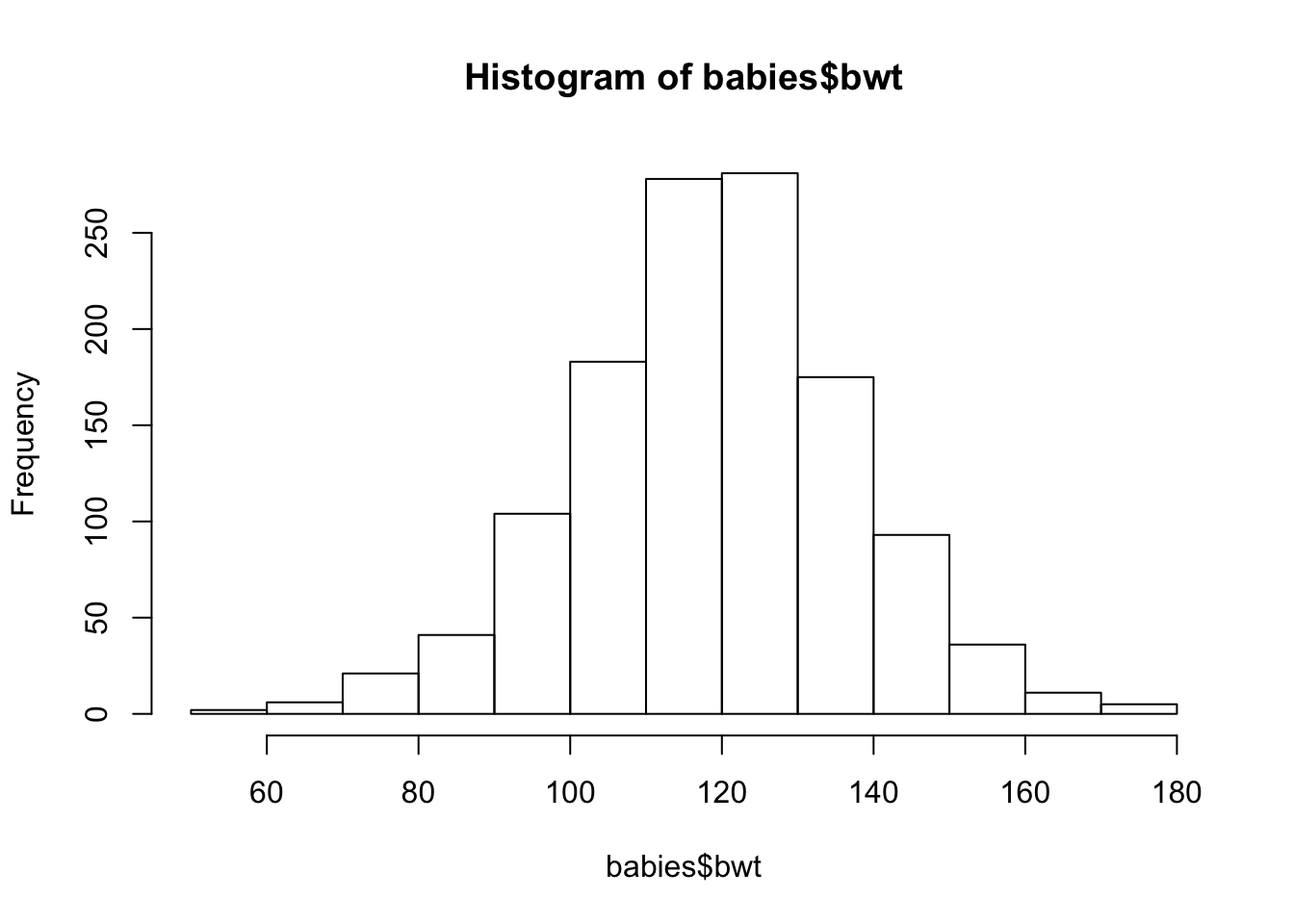
Figure 6.1: Simple Histogram
Next, we show how to customize the histogram by specifying some of its features (see Figure 6.2). That is, we
- provide a more informative label for the x-axis
- remove the title because it is redundant with the caption
- change the y scale from counts to density so that area of a bar represents the percentage of babies in the interval
- suggest more intervals in the histogram to see the shape better
- specify the limits of the x and y axes to zoom in on the histogram
hist(babies$bwt,
     xlab="Birth Weight (oz)",
     main = "",
     freq = FALSE,
     breaks = 30,
     xlim = c(50, 190), ylim = c(0, 0.025)
     )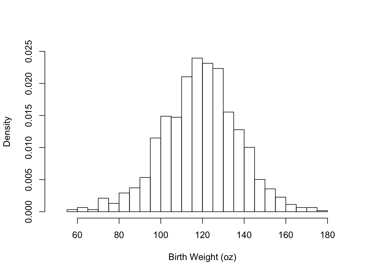
Figure 6.2: Supplying Arguments to Customize the Histogram
Lastly, we show how to add additional features to the plot by calling a few low-level functions (see Figure 6.3). Specifically, we:
- overlay a normal curve (using the
curve()function) onto the histogram. The normal curve has a center and spread that matches the birth weight center and spread. Note that we specify that the curve is to beadded to the plot, otherwise a new plot is created rthat contains only the normal curve. We also supply arguments tocurve()to control the thickness, type, and color of the curve. - add a vertical line, i.e., a reference marker, at 88 oz. This value is the cutoff for a low birth weight determination. We use the function
abline()to do this, and we specify the width and color of the line. - add text to the plot to specify that the vertical line marks the low birth weight cutoff. In the function call to
text(), we provide the (x, y) position for the text, the text to be added to the plot, and the relative size of the characters.
hist(babies$bwt,
     xlab="Birth Weight (oz)", main = "",
     freq = FALSE,  breaks = 30,
     xlim = c(50, 190), ylim = c(0, 0.025) )

curve(dnorm(x, mean = mean(babies$bwt), sd = sd(babies$bwt)),
      add = TRUE, lwd = 3, lty = 2, col= "gray")

abline(v = 88, lwd = 3, col = "red")
text(x = 88, y = 0.015, label = "Low\n Birth\n Weight",
     cex = 0.8, pos = 2)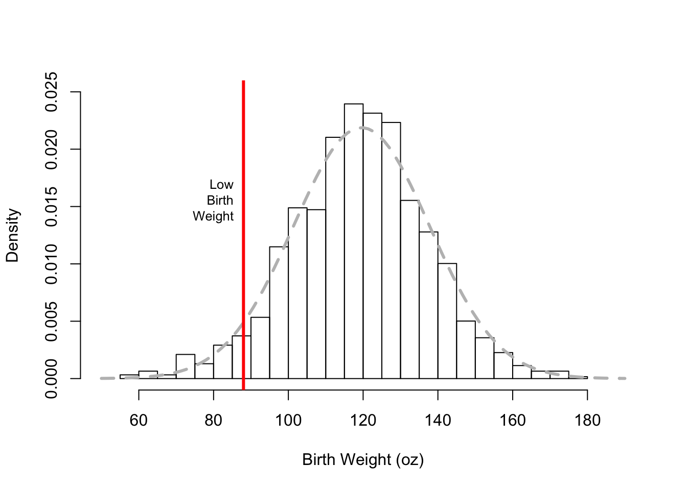
Figure 6.3: Adding More Features to the Histogram
One more example of a histogram is displayed in Figure 6.4. This histogram shows the distribution of the parity of the pregnancy, i.e., the number of previous pregnancies. Here a value of 0 means this baby is the woman’s first pregnancy, 1 her second, etc. The mother’s parity is a discrete quantitative variable because only integer values are possible, i.e.,
table(babies$parity)##
## 0 1 2 3 4 5 6 7 8 9 10 11 13
## 315 310 238 168 83 52 32 16 8 7 4 2 1Notice that the histogram in Figure 6.4 has bins that are mostly 1 unit wide, but the 3 rightmost bins are wider. They are 2, 3, and 3 units wide, respectively. We use wider bins in the tails of the distribution to further smooth the data. Additionally, to make it clear that parity only takes integer values, we center the bins on the integers, e.g., the bin from 1.5 to 2.5 contains those mothers with a parity of 2.
hist(babies$parity, freq = FALSE,
     breaks = c(seq(-0.5, 5.5, by = 1), 7.5, 10.5, 13.5),
     main = "", xlab = "Number of Previous Pregnancies")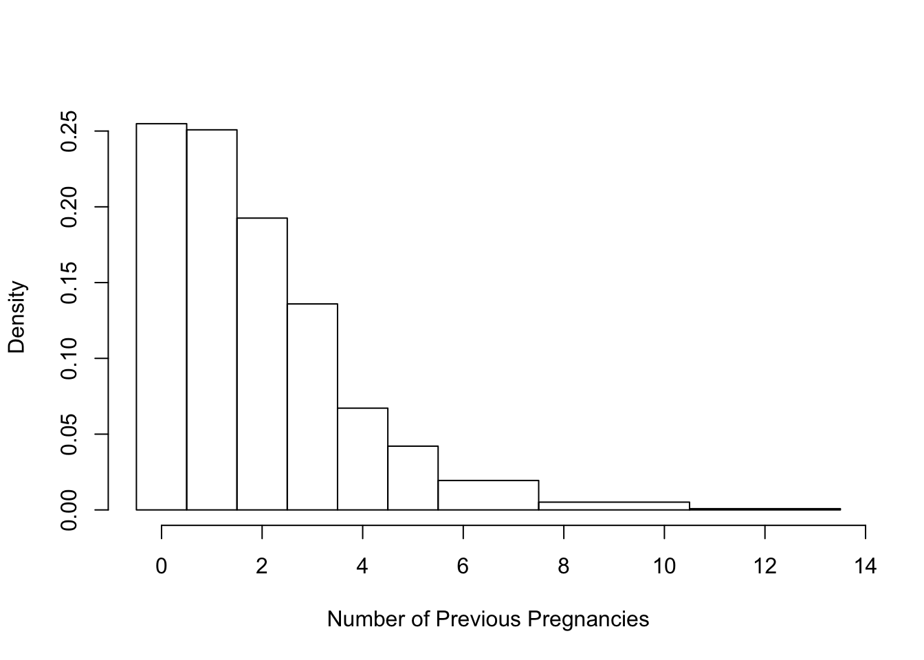
Figure 6.4: Histogram with Unequal Bins
6.2.2 Scatter Plot of Mother’s Height and Baby’s Birth Weight
Our next plot is a scatter plot of mother’s height and baby’s weight. We focus on comparing the never-smokers and the current smokers. For simplicity, we place these data in a separate data frame with
babies2 = subset(babies, smoke == "Never" | smoke == "Current")For our first plot, we again start with the default plotting parameters, and make a simple call to plot(). The resulting scatter plot appears in Figure 6.5.
plot(x = babies2$ht, y = babies2$bwt)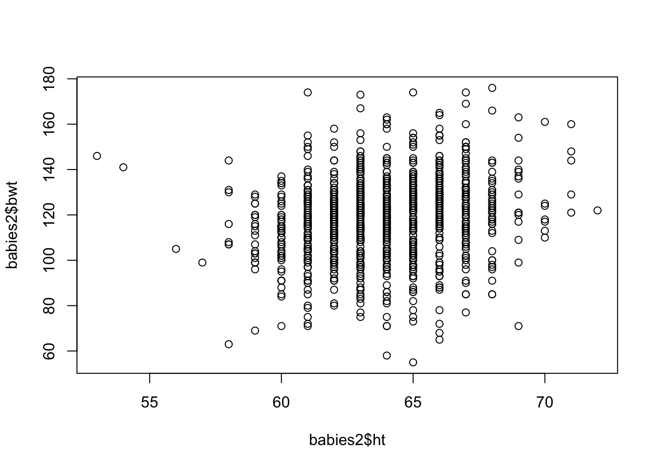
Figure 6.5: Default Scatter Plot
The basic plot in Figure 6.5 can be improved in many ways. We introduce some of the parameter values to plot() in order to improve our plot. The changes result in Figure 6.6. Specifically, we make the following changes.
- change the plotting symbol to filled in circles (
pch = 19) and shrink the symbol to 40% of the size in the original figure (cex = 0.4). There are over a thousand points in the plot and these changes will help us see their distribution better - use the value of smoking status (in the variable
smoke) to color the points so that the babies born to smokers and never-smokers can be distinguished - add a small amount of random noise
to the x and y coordinates of the points (using thejitter()function) so the points don’t overlap as much. - zoom in on the main portion of the data (mothers between 58 and 71 inches tall). That is, a few unusually short mothers are excluded from the plot so that we can fill the data region and focus on the bulk of the observations
- replace default axis labels with more informative ones
with(babies2,
     plot(x = jitter(ht, amount = 0.5),
          y = jitter(bwt, amount = 0.5),
          xlim = c(58,71),
          pch = 19, cex = 0.4, col = smoke,
          xlab = "Mother's Height (in)", ylab = "Birth Weight (oz)"))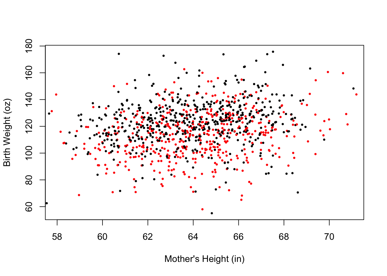
Figure 6.6: Improved Scatter Plot
Next, we add two smooth curves to the plot, one each for the current and never smokers. These curves follow the local average of birth weight for mothers of roughly the same height. The code to get the (x, y) values for these curves is below. Don’t worry if you are unfamiliar with the statistical procedure; the focus here is to show you how to add curves to the scatter plot.
bwtN.lo = loess(bwt ~ ht,
            data = subset(babies2, smoke == "Never"), span = 0.5)
bwtS.lo = loess(bwt ~ ht,
            data = subset(babies2, smoke == "Current"), span = 0.5)

gridHt = data.frame(ht = seq(59, 69, 0.2))
pred.bwtN = predict(bwtN.lo, gridHt, se = FALSE)
pred.bwtS = predict(bwtS.lo, gridHt, se = FALSE)
The gridHT data frame contains about 50 equal spaced values of height from 59 to 69 inches. Additionally, pred.bwtN contains the predicted birth weight for never smokers for each of the height values in gridHT, and pred.bwtS has predictions for smokers. The final step is to plot each set of points connected by line segments.
We reproduce the plot in Figure 6.6 and then + add the pairs (height, predicted birth weight) for non-smokers and connect the dots with lines(). + add the (height, predicted birth weight) pairs for the smokers, connecting the points with line segements. + place a legend (with a call to legend()) in the top left of the plot where the color and line type matches the smoking status. The legend function aids the viewer in distinguishing between the two groups.
The resulting plot is in Figure @ref{fig:loessSP}. We matched the color of the curves to the associated group, used different line types to help distinguish between the curves, and made the lines thicker so that they stand out from the point cloud. The code appears below.
with(babies2,
     plot(x = jitter(ht, amount = 0.5),
          y = jitter(bwt, amount = 0.5),
          xlim = c(58,71),
          pch = 19, cex = 0.4, col = smoke,
          xlab = "Mother's Height (in)", ylab = "Birth Weight (oz)"))

lines(x = gridHt$ht, y = pred.bwtN, col = "black", lwd = 4)
lines(x = gridHt$ht, y = pred.bwtS, col = "red", lwd = 4, lty = 2)

legend("topleft", legend = c("Never Smoker", "Current Smoker"),
       lty = c(1, 2), lwd = 3, col = c("black", "red"),
       bty = "n")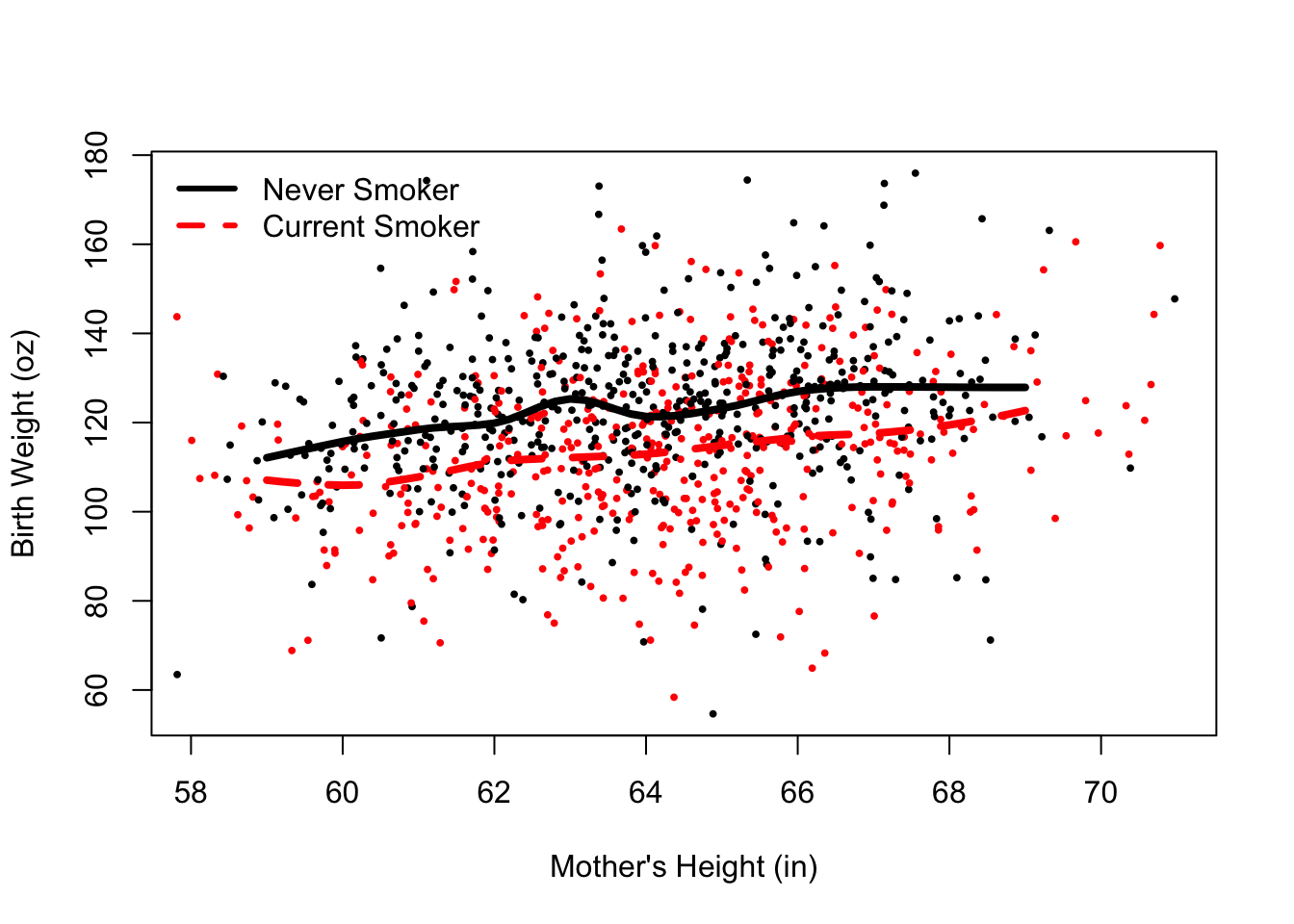
Figure 6.7: Scatter Plot with Local Smooths
6.2.3 Interaction Plot of Mother’s Education and Smoking Status
For our third example, we demonstrate how to make bar charts, dot charts, and interaction plots. We begin with simple one-variable charts of smoking status. The 3 plots in Figure 6.8 display the proportion of mothers in each smoking status via (top to bottom) a bar chart, pie chart, and dot chart. The labels denote whether the mother Never smoked, Currently smokes (while pregnant), smoked Until she became pregnant, or smoked Once and quit well before pregnancy.
Note that we need to create a table of percentages as the input argument to these functions.
oldPar = par(mfrow = c(2, 2),
             mar = c(2, 2, 2, 2))

tableSmoke = 100 * table(babies$smoke) / sum(table(babies$smoke))
round(tableSmoke, digits = 2)
##
##   Never Current   Until    Once
##   44.37   39.48    7.75    8.40

barplot(tableSmoke, cex.names = 0.75, ylim = c(0, 50))
pie(tableSmoke, cex = 0.8)
dotchart(tableSmoke, xlim = c(0, 50))
## Warning in dotchart(tableSmoke, xlim = c(0, 50)): 'x' is neither a vector
## nor a matrix: using as.numeric(x)

par(oldPar)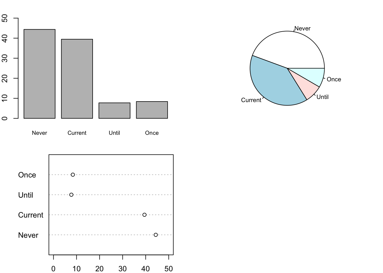
Figure 6.8: Bar Plot, Pie Chart, and Dot Plot of Smoking Status
The call to the par() function provides one argument: mfrow. We specify mfrow = c(2, 2) so that we can place the plots on the same canvas, the value c(2, 2) indicates that we want a two by two grid of plots (one cell in the grid has no plot). We assign the return value from par() to the variable oldPar, which contains the values of the plotting parameters before changing them. We use oldPar to reset the parameter values when we finish this plot. Otherwise, the new plotting parameters would remain in effect and, e.g., we would be plotting 4 plots to a canvas in future plot calls. Another useful argument to par() is mar. For example, mar = c(2, 2, 2, 2) specifies the margins for the plots to be all the same. When making a grid of plots, it tends to work best when the margins are smaller than the default values. The default is 5, 4, 4, 2 for the bottom, left, top, and right.
When we examine the relationship between 2 qualitative variables, we examine proportions of one variable within the subgroups defined by the other variable. For example, with education and smoking status, we can compare the proportion of never, current, until pregnant, and once smokers within each education level. To do this, we make a two-way table, such as
tableEdSmoke = table(babies$smoke, babies$ed)
tableEdSmokeC1 = tableEdSmoke/
  matrix(colSums(tableEdSmoke), nrow = 4, ncol = 5, byrow = TRUE)
round(tableEdSmokeC1, digits = 3)
##
## < 12th HS Trade Some Col College
## Never 0.345 0.459 0.371 0.466 0.498
## Current 0.530 0.400 0.486 0.345 0.297
## Until 0.065 0.091 0.043 0.071 0.082
## Once 0.060 0.050 0.100 0.118 0.123We create a visualization of this table with side-by-side bars (see Figure 6.9). We begin by creating a named vector of colors. These color values are character strings that correspond to the hexadecimal value of the color. We have given them names to cross check that we provided the correct labels. After the call to the barplot() function, we augment the plot with a legend for the colors to the plot.
edColor = c(u12 = "#377eb8", hs = "#e41a1c", tr = "#4daf4a",
            sc = "#984ea3", co = "#ff7f00")

barplot(t(tableEdSmokeC1), beside = TRUE, col = edColor)

legend("topright", title ="Education",
       legend = c("< 12", "HS", "Trade", "Some College", "College"),
       fill = edColor,  bty = "n")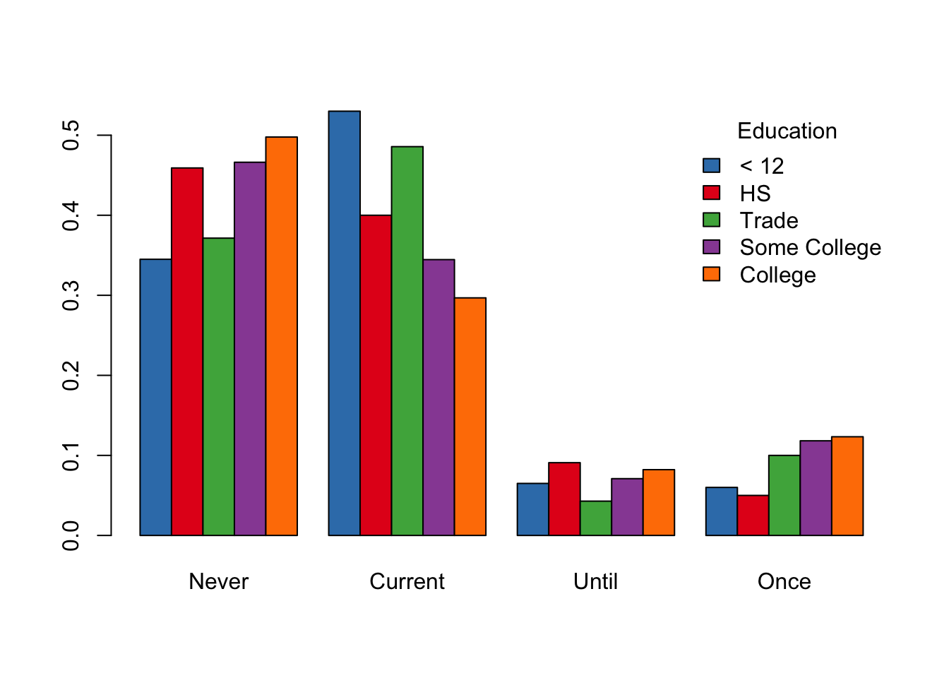
Figure 6.9: Side-by-Side Bar Plot of Smoking Status and Education
Our last plot in this section is a line plot (see Figure 6.10), which is better known as an interaction plot. The matplot() function overlays multiple calls to plot() on the same canvas. In this case, we want to control the appearance of the axes. Specifically, we want to put labels on the x-axis that correspond to the categories of smoking. We do this by first suppressing the creation of the axes in the matplot() call with the argument axes = FALSE. Next we add axes to the plot with two calls to axis(). The first provides meaningful labels to the tick marks on the x axis, and the second call simply creates the default y axis. Lastly, we add the same legend as in Figure 6.9 to the interaction plot, with the exception of displaying the line types as well as colors.
matplot(x = 1:4, y = (tableEdSmokeC1),
        type = "l", lwd = 3, col = edColor,
        ylim = c(0, 0.6), ylab = "Proportion", xlab = "Smoking Status",
        axes = FALSE)

axis(1, at = 1:4, labels = c("Never", "Current", "Until", "Once"))
axis(2)

legend("topright", title ="Education",
       legend = c("< 12", "HS", "Trade", "Some College", "College"),
       col = edColor, lty = 1:5, lwd = 3, bty = "n")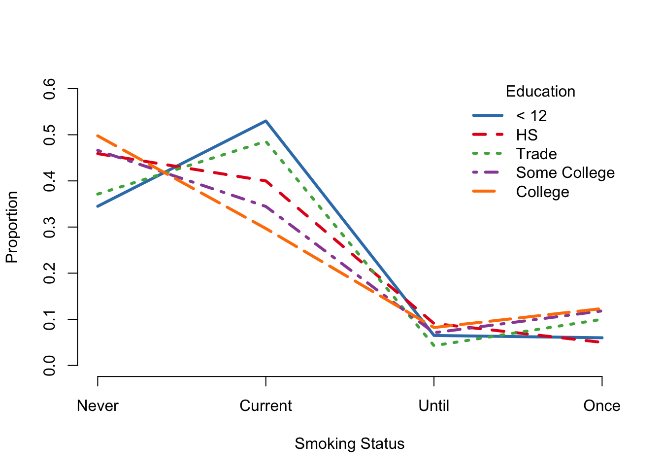
Figure 6.10: Interaction Plot of Smoking and Education
Color
There are several ways to specify colors in R. We can use strings of color names, integer values, hexaddecimal values, and named palettes.
Below is an example. The color of a line is specified by one of the methods.
plot(1,1, xlim = c(0,2), ylim = c(0,2),
     xlab = "", ylab ="", type = "n")

abline(a = -0.5, b = 1, col = 30, lwd = 3)
abline(a = 0, b = 1, col = "cornflowerblue", lwd = 3)
abline(a = 0.5, b = 1, col = "#e41a1c", lwd = 3)
abline(a = 1, b = 1, col = terrain.colors(3)[2], lwd = 3)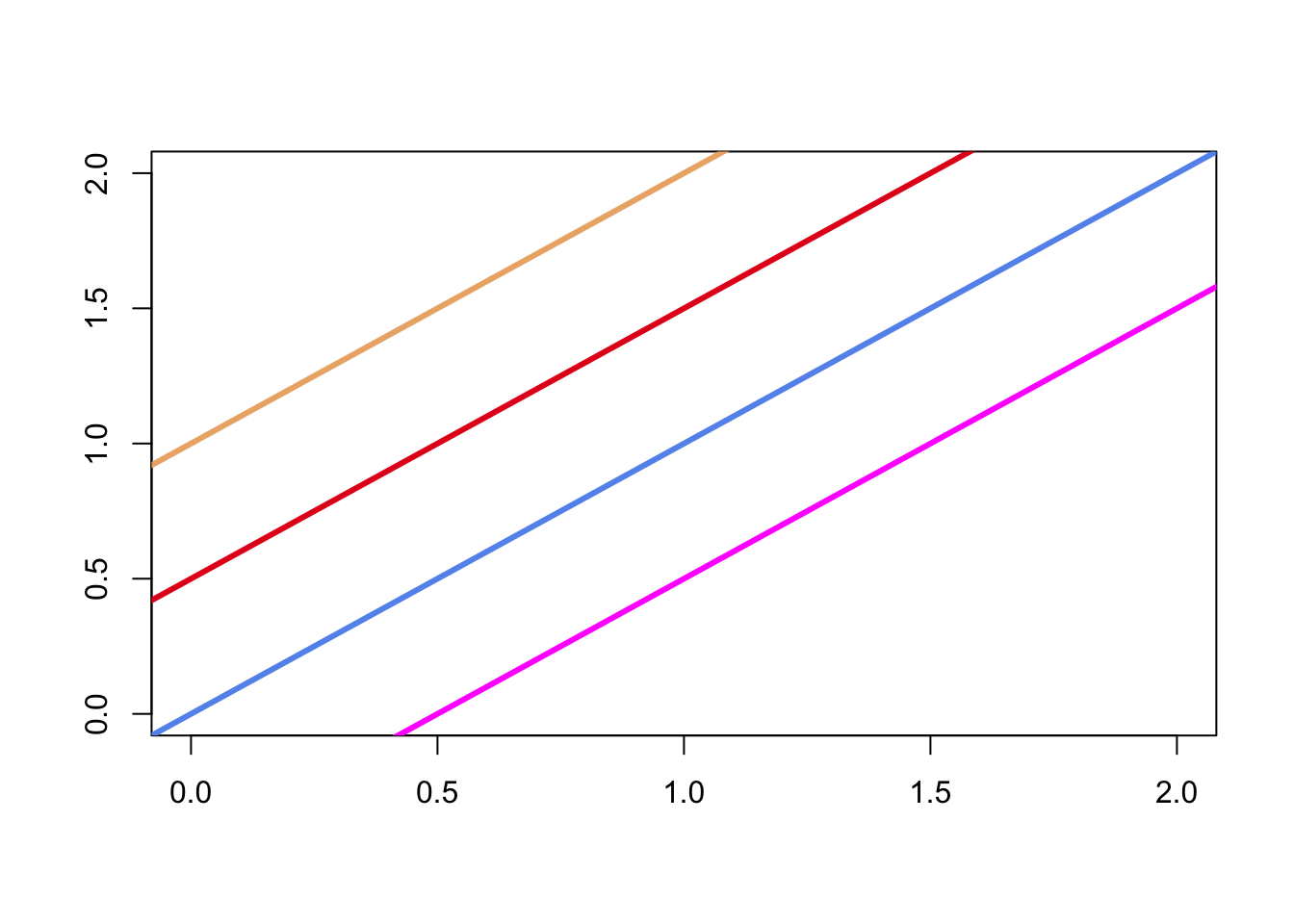
6.2.4 Box Plot of Birth Weight by Smoking Status
We wrap up this section with a simple box plot of birth weight for each smoking status. We use the colors from the interaction plot to color each group’s box (see Figure 6.11).
boxplot(bwt ~ smoke, data = babies, col = edColor)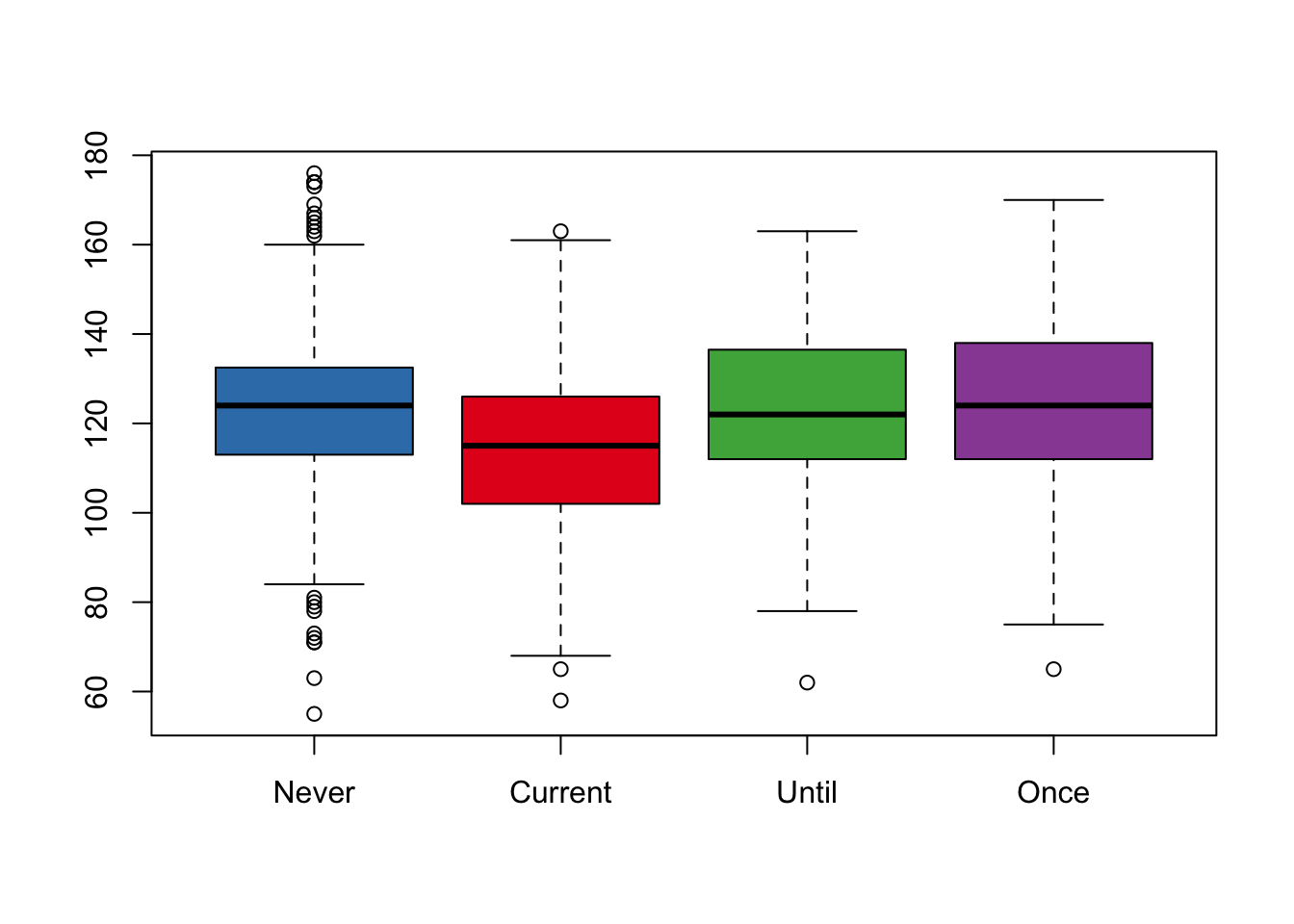
Figure 6.11: Box Plot of Brith Weight by Smoking
6.3 Grammar of Graphics Model in ggplot2
The implementation of the grammar of graphics in ggplot2 takes a different approach to constructing statistical graphs. We begin by defining an empty plot object with ggplot(). Then we add layers to the plot by specifying the graphics shapes, called geoms, with which to view the data, e.g., plotting symbols and lines. These geoms are added to the plot object with the + operator.
Each layer can have its own data (which must be in a data frame) and aesthetic mapping. Alternbatively, the data and aesthetic mapping can be specified in the call to ggplot(), and a layer can use that data and mapping (or speicfy its own). The aesthetic mapping connects variables in the data frame to a feature of the plot, such as x and y locations, color, and size. As an example, the aesthetic: aes(x = ht, y = bwt, color = smoke) for the babies data, maps mother’s height to the x-axis, birth weight to the y-axis, and uses color to denote smoking status. This aesthetic mapping can be used to add points or lines to a plot. That is, geom_point() will add points (mother’s height, birth weight) to the plot and color them according to smoking status.
We can customize aesthetics, in various ways. For example, we can change the scale for the y axis to log, provide a special label on the x-axis, or specify a palette for the colors. We do this by adding scale functions to the plot. That is, scale_y_continuous() has parameters name to specify the axis label, breaks to provide the location of the tick marks, trans to use a transformation such as log, limits to denote the range of the scale, etc. Scale functions are also available for discrete-valued axes and for color, shape, line type, size, etc.
Additionally, details related to the appearance of axes, size of text, background color for the plotting region, etc. are specified through plotting themes.
When we create a plot, we call ggplot() and then add layers of data mapped to aesthetics, and, if desired, we can further customize the plot with scale and theme specifications. We provide several examples that remake the plots made using base graphics in Section 6.2.
6.3.1 Histogram of Birth Weight
We begin by recreating the histogram from Section 6.2.1 (see Figure 6.1). That is, we take all of the default arguments to ggplot(). The ggplot version of the default histogram appears in Figure 6.12. We provide the data frame and specify the aesthetic mapping in the call to ggplot(). Then, we add a layer where we identify the histogram geom, i.e., geom_histogram().
require(ggplot2)

ggplot(data = babies, aes(x = bwt)) +
  geom_histogram()
## `stat_bin()` using `bins = 30`. Pick better value with `binwidth`.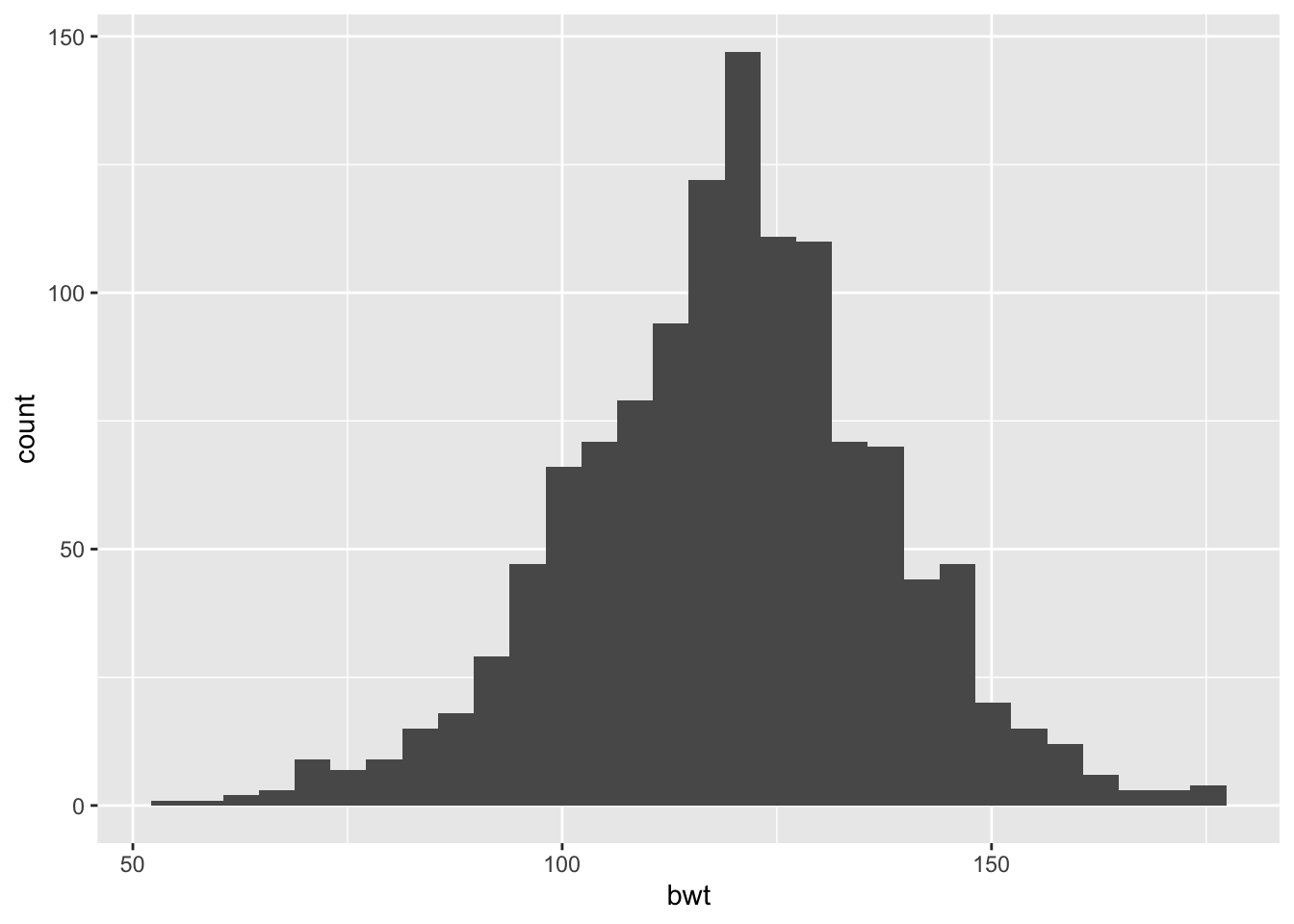
Figure 6.12: Default Histogram of Birth Weight (oz)
We can specify the data and the aesthetic mapping in the call to ggplot() as we did in the code to make Figure 6.12, or we can provide this information in a layer. When the aesthetic mapping and data are specified in ggplot(), they are available to all layers, and they can be overridden in a specific layer. Since we have only one layer in this plot (the geom_histogram), it makes no difference where we provide the data and mapping so we specify them in the call to ggplot().
In the next plot (see Figure 6.13), we override some of the default labels and colors and we change the y-axis to density rather than count to make a histogram like the one in Figure 6.2. In the call to geom_histogram(), we specify a transparency for the fill color in the bars, and we change the color of the border of the bars. We also add an aesthetic mapping that maps the y-dimension to ..density.., which is a computed value that the geom provides. Notice also that we have modified the x-axis scale by providing an axis label in the call to scale_x_continuous().
ggplot(data = babies, aes(x = bwt)) +
  geom_histogram(aes(y = ..density..), alpha = 0.4, col = "black") +
  scale_x_continuous(name = "Birth Weight (oz)")
## `stat_bin()` using `bins = 30`. Pick better value with `binwidth`.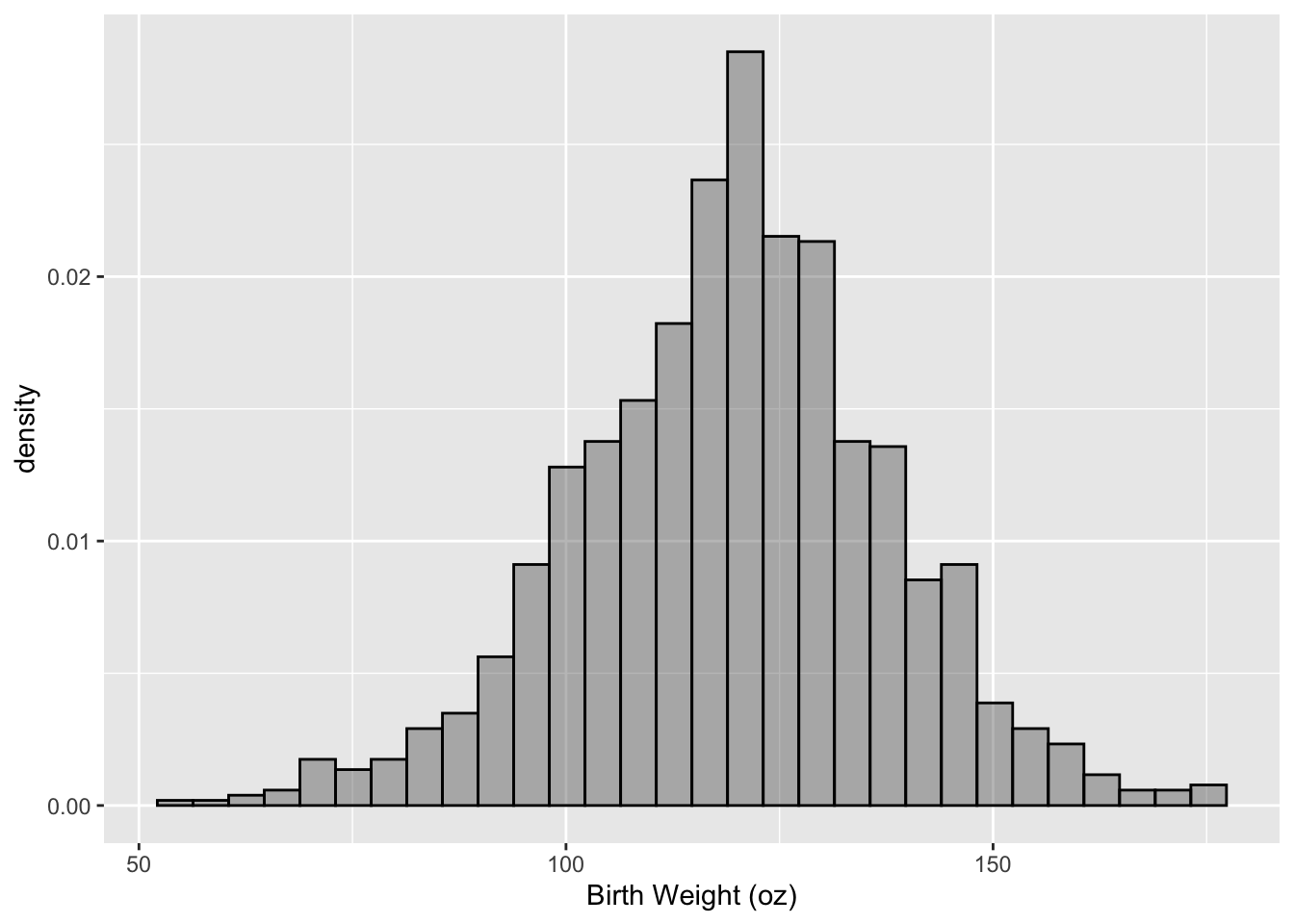
Figure 6.13: Histogram of Birth Weight (oz)
We make the next version of this histogram (see Figure 6.14) to imitate the histogram in Figure 6.3. We augment the histogram by adding three layers, and we customize the scale for the x axis. We describe the scale customization and each of the new layers below:
- We use the
labs()function rather thanscale_x_continuous()to specify the x-axis label.labs()is a convenience function that takes labels for the x and y axes, the title of the plot, and legend titles so if all we want to change is labels/titles then one call tolabs()is an easier approach. - The first layer that we add a vertical line. We call
geom_vline()and provide details about the line location, thickness, and color. Note that this color is quite different than a color aesthetic mapping. We are not connecting it to a variable. - The second layer adds the normal curve to the plot. We call
stat_function()to do this. A few layers, like this one, are more easily specified via statistical functions. See Section 6.3.5 to learn more about the general concept of a layer and how the geom and stat_function relate to the layer. - Lastly we add a text layer to the plot by calling
annotate(). This kind of layer does not behave like the geom layers. Specifically, theannotate()does not map variables in a data frame to aesthetics. Instead, the input arguments are provided via vectors. This kind of layer is useful for adding fixed reference information to plots.
ggplot(data = babies, aes(x = bwt)) +
  geom_histogram(aes( y = ..density..), alpha = 0.4, col = "black") +
  labs(x = "Birth Weight (ounces)") +
  geom_vline(xintercept = 88, lwd = 2.5, col = "red") +
  stat_function(fun=dnorm,
                color="black", size = 2, linetype = "dashed",
                args=list(mean = mean(babies$bwt),
                          sd = sd(babies$bwt))) +
  annotate(geom = "text", x = 82, y = 0.02,
           label = "Low\n Birth\n Weight", size = 3)
## `stat_bin()` using `bins = 30`. Pick better value with `binwidth`.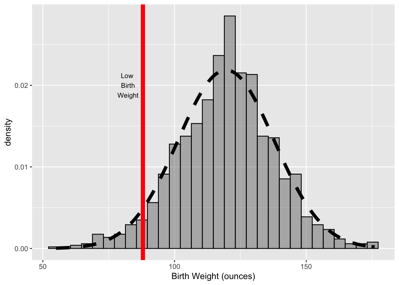
Figure 6.14: Histogram of Birth Weight (oz) with Marker and Normal Curve
6.3.2 Scatter Plot of Mother’s Height and Baby’s Birth Weight
We next make a few versions of scatter plots of mother’s height and baby’s weight. We follow the design of the plots in Section 6.2.2 and make 3 plots:
- a “default” scatter plot like Figure 6.5
- a plot with jittering and color, like Figure 6.6
- a plot with smooth splines, as in Figure 6.7
As before, we use the baby2 data frame that contains only the never and current smokers.
For our first plot, we provide only the data frame and the mapping of ht to the x-axis and bwt to the y-axis. We provide this information in the geom_points() call, rather than the ggplot() call. The resulting scatter plot appears in Figure 6.15.
ggplot() +
  geom_point(data = babies2, aes(x = ht, y = bwt),
na.rm = TRUE) 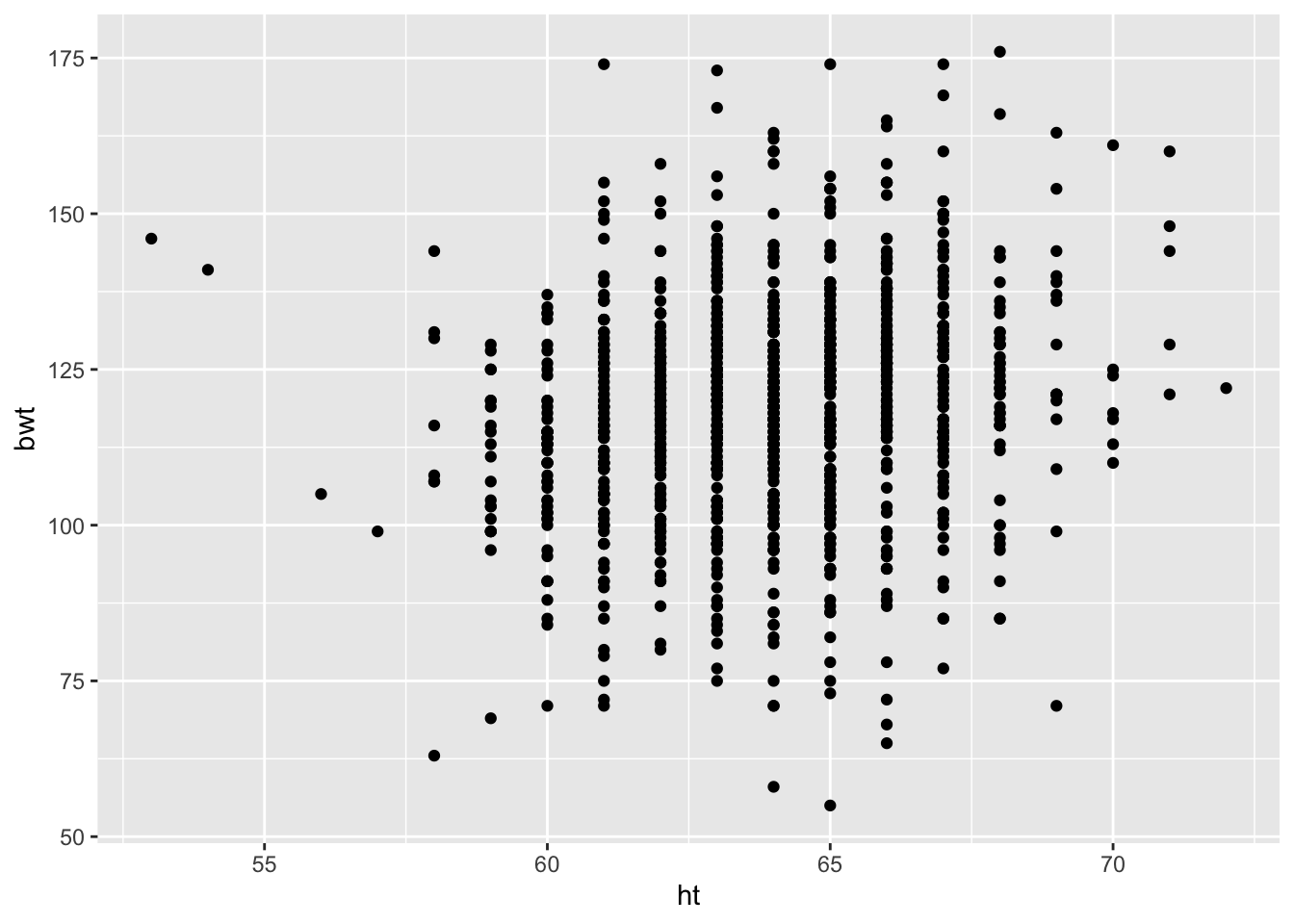
Figure 6.15: Default Scatter Plot
To improve this plot, we:
- jitter points by using the
geom_jitter()layer instead ofgeom_point()layer. Note that we specify the amount of jittering withwidth = 0.5and we also provide other argulments to control the appearance of the points. In particular, we specify the relative size of the points compared to the default (size = 0.75) and the transparency ofthe point coloralpha = 0.8. - label the axes with calls to
scale_y_continuou()andscale_x_continuous(), and we specify the x-axis limits - specify the colors to use for the color aesthetic (with
scale_color_manual()). The use of a color aesthetic automatically produces a legend.
See Figure 6.16 for the customized plot.
ggplot(data = babies2, aes(x = ht, y = bwt, color = smoke)) +
  geom_jitter(width = 0.5, size = 0.75, alpha = 0.8) +
  scale_x_continuous(name = "Mother's Height (in)",
                     limits = c(58, 71)) +
  scale_y_continuous(name = "Birth Weight (oz)") +
  scale_color_manual(values = c("black", "red"))
## Warning: Removed 31 rows containing missing values (geom_point).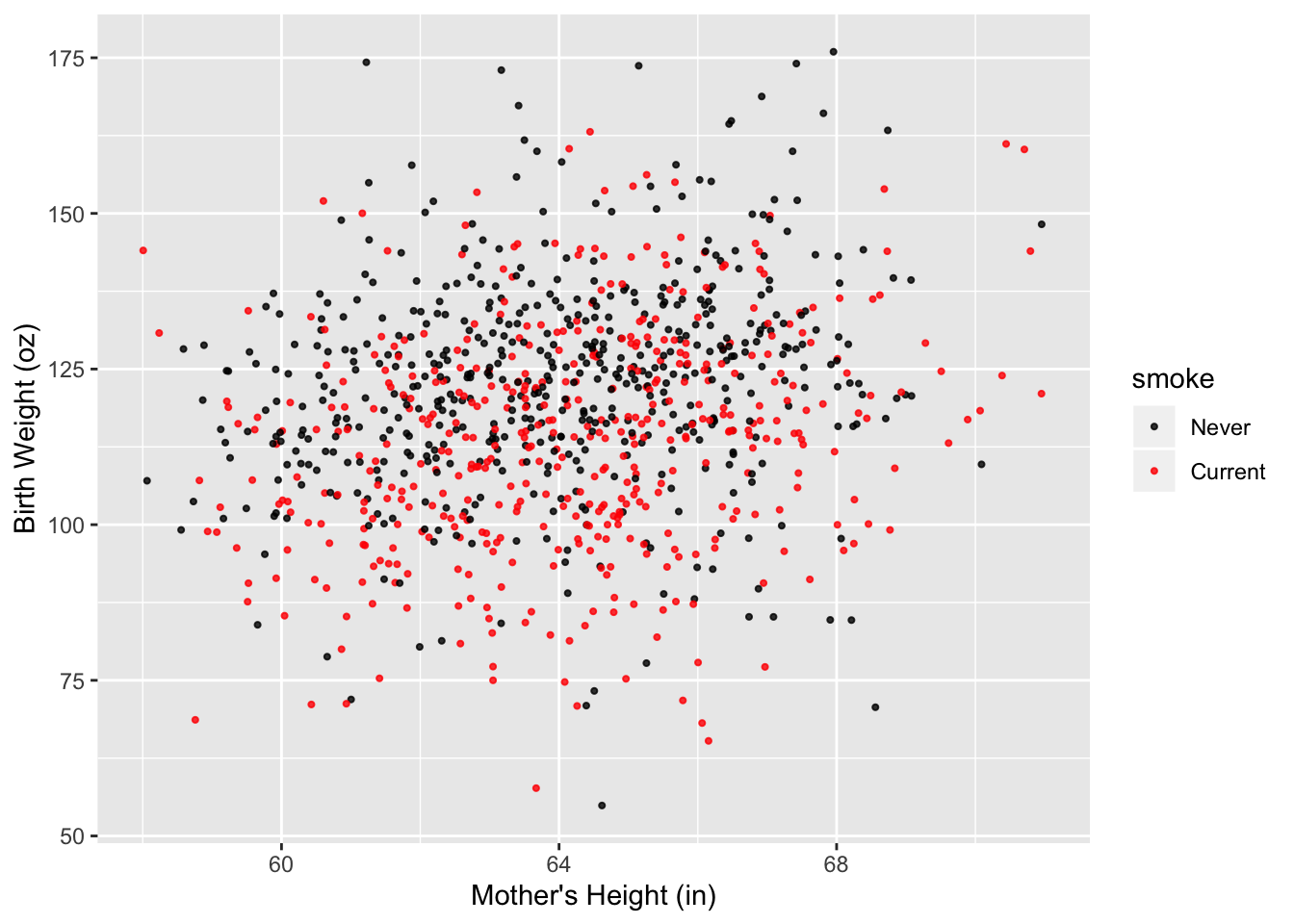
Figure 6.16: Improved Scatter Plot
Next, we use the predicted birth weights for smokers and never smokers found in the previous section (bwtN.lo and bwtS.lo) to add two smooth curves to the plot. Recall that gridHT contains about 50 equal-spaced values of height from 59 to 69 inches and bwtN.lo and bwtS.lo are the birth weight predictions for those values of height for never and current smokers, respectively.
The resulting plot is in Figure 6.17.
Each smoothed curves is an additional layer on the plot. We call geom_line() to add each curve. Notice that in each calls to geom_line(), we override the data and aesthetic mapping in ggplot() and supply a new data frame constructed from gridHt$ht and either pred.bwtN or pred.bwtS. We needed to combine the vectors into a single data frame because the data must be provided as a data frame in ggplot.
Our geom_line() calls also specify the color and line-type of the curves., and use different line types to help distinguish between the curves, and made the lines thicker so that they stand out from the point cloud.
We also use theme() to change the location of the legend, and we added text for the labels to the color scale. The code appears below.
pred.df = data.frame(htGrid = gridHt$ht,
                     predBWTNever = pred.bwtN,
                     predBWTSmoker = pred.bwtS)

ggplot(data = babies2, aes(x = ht, y = bwt, color = smoke)) +
  geom_jitter(width = 0.5, size = 0.75, alpha = 0.8, na.rm = TRUE) +
  geom_line(data = pred.df,
            aes(x = htGrid, y = predBWTNever),
            color = "black", size = 2, linetype = "solid") +
  geom_line(data = pred.df,
            aes(x = htGrid, y = predBWTSmoker),
            color = "red", size = 2, linetype = "dashed") +
  scale_x_continuous(name = "Mother's Height (in)", limits = c(58, 71)) +
  scale_y_continuous(name = "Birth Weight (oz)") +
  scale_color_manual(values = c("black", "red"),
                     labels = c("Never Smoker", "Current Smoker")) +
theme(legend.position = c(0.1, 0.9)) 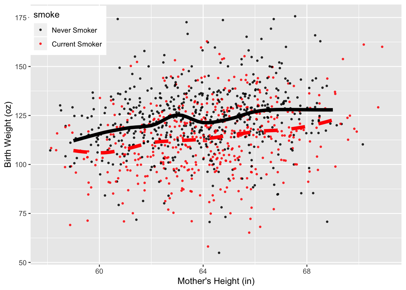
Figure 6.17: Scatter Plot with Local Smooths
6.3.3 Interaction Plot of Mother’s Education and Smoking Status
The third example demonstrates how to make bar charts, dot charts, and interaction plots. We begin with simple one-variable charts of smoking status that are similar to the plots in Figure 6.8. The ggplot versions appear in Figure 6.18.
The first two calls use the special variable in ggplot called ..count... This variable is available in geom_histogram() and geom_bar(). We do not use it in the dot chart because it is not available in geom_point(). Instead, to make dot chart, we use the table created earlier in Section 6.2.3, and convert it to a data frame as required by ggplot.
Additionally, ggplot treats NA values as a category in factor vectors so we elimnate the NA values from the data frame.
require(gridExtra)

babiesNoNA = subset(babies, !is.na(babies$smoke))

bp = ggplot(data = babiesNoNA, aes(x = smoke)) +
  geom_bar(aes(y = (..count..)/sum(..count..))) +
  labs(x = "Smoking Status", y = "Percent")


pc = ggplot(data = babiesNoNA) +
  geom_bar(aes(x = "", y =  (..count..)/sum(..count..),
               fill = smoke)) +
  coord_polar("y", start=0)

dc = ggplot(as.data.frame(tableSmoke), aes(y = Var1 , x = Freq) ) +
  geom_point(size = 2) +
  labs(y = "Smoking Status", x = "Percentage")

grid.arrange(bp,pc, dc, ncol=2, nrow = 2)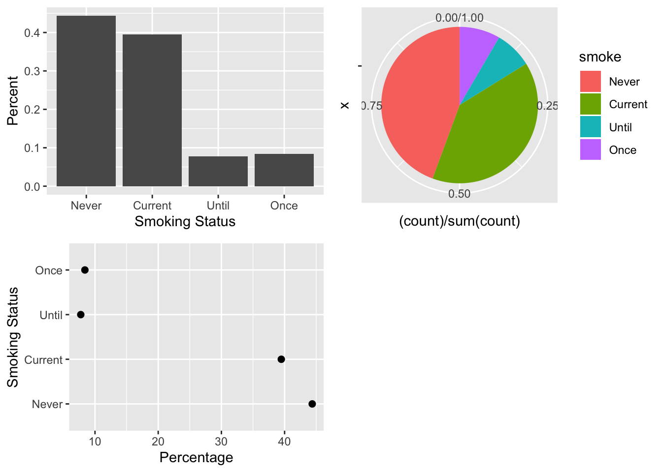
Figure 6.18: Bar Plot, Pie Chart, and Dot Plot of Smoking Status
To place three plots in a 2 by 2 arrangement, we use the gridExtra package. When we call ggplot() to create a plot, nothing is printed. Instead, we assign the plot object to a variable: bp for the bar plot; pc for the pie chart; and dc for the dot chart. Then, we pass these ggplot objects to grid.arrange() to print them in the desired arrangement.
To create a plot like Figure 6.9, where we examine the relationship between 2 qualitative variables, we use the table created earlier called tableEdSmokeC1 (which we convert to a data frame).
edSmDF = as.data.frame(tableEdSmokeC1)
names(edSmDF) = c("smoke", "educ", "frac")

head(edSmDF)
## smoke educ frac
## 1 Never < 12th 0.345000000000
## 2 Current < 12th 0.530000000000
## 3 Until < 12th 0.065000000000
## 4 Once < 12th 0.060000000000
## 5 Never HS 0.459090909091
## 6 Current HS 0.400000000000Notice that the smoke and educ variables in our new data frame run through all the combinations of smoking status and education level, and for each combination, the frac variable gives a fraction, which represents the fraction of the mothers in the particular education level who are Never, Current, Until, and Once smokers.
The aesthetic mapping in the ggplot() call below identifies 3 mappings:
- the x axis is mapped to smoking status,
- the y-axis is mapped to
fracand - the fill aesthetic is mapped to education.
The fill aesthetic can be rendered in several ways in the plot, e.g., stacked bars, and side-by-side bars. The position = "dodge" argument in geom_bar() indicates that fill will be rendered as dodged or side-by-side bars.
The geom_bar() call also contains the argument stat = "identity". This argument essentially means that the values in frac will be used unmodified on the y-axis. Many layers have a stat argument, which is used to specify the statistical transformation to use on the data for that layer. (See Section 6.3.5 for more details on the layer in ggplot).
ggplot(data = edSmDF,
       aes(x = smoke, y = frac, fill = educ)) +
  geom_bar(stat = "identity", position = "dodge") +
  labs(x = "Smoking Status", y = "Percentage") +
  scale_fill_discrete(name ="Education",
    labels = c("< 12", "HS", "Trade", "Some College", "College")) +
  theme(legend.position = c(0.8, 0.8))
Figure 6.19: Side-by-Side Bar Plot of Smoking Status and Education
Our last plot to remake is the interaction plot in Figure 6.10. We use the same data frame, edSmDF (created from the table tableEdSmokeC1 in Section 6.2.3). We specify new aesthetic mappings:
smokeis mapped to x as beforefracis mapped to y as beforeeducis mapped to color as beforeeducis also mapped tolinetypeeducis mapped togroupingeom_line()(but that mapping is not available ingeom_point())
This mapping of education to three aesthetics yields line with unique colors and line types for each education level. See Figure 6.20.
ggplot(data = edSmDF,
       aes(x = smoke, y = frac, color = educ, linetype = educ)) +
  geom_line(aes(group = educ), size = 1.5) +
  geom_point(size = 2) +
  labs(x = "Smoking Status", y = "Percentage",
       color = "Education", linetype = "Education",
       labels =  c("< 12", "HS", "Trade", "Some College", "College")) +
  scale_color_brewer(palette = "Dark2")  +
  theme(legend.position = c(0.8, 0.8),
        legend.text = element_text(size = 8),
legend.key.width = unit(3, "line")) 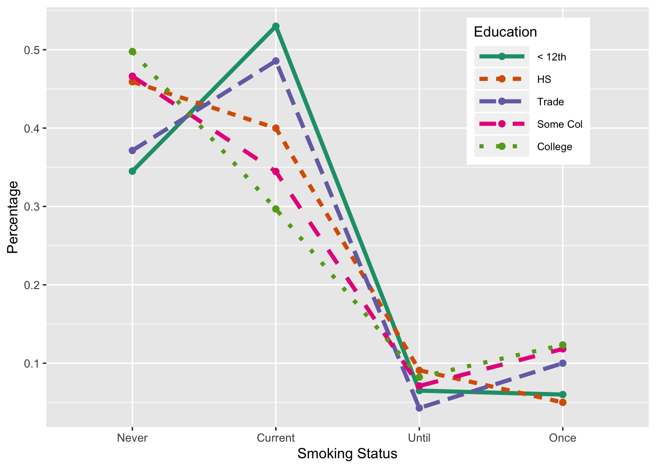
Figure 6.20: Interaction Plot of Smoking and Education
6.3.4 Box Plot of Birth Weight by Smoking Status
We wrap up this section with a simple box plot of birth weight for each smoking status. We use the colors from the interaction plot to color each group’s box (see Figure 6.11).
ggplot(data = babies[!is.na(babies$smoke), ],
       aes(x = smoke, y = bwt)) +
  geom_boxplot(fill = edColor[1:4]) +
  labs(x = "Smoking Status")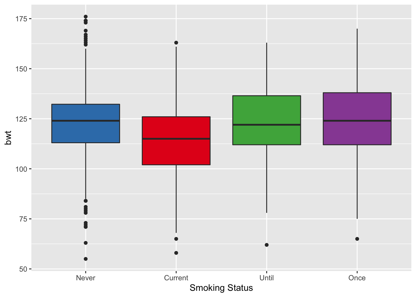
Figure 6.21: Box Plot of Birth Weight by Smoking
6.3.5 Layers
We demonstrate the concept of layers and plot objects. A call to ggplot() creates a plot object, which it need not print. Below we assign a call to ggplot() to the variable bwtPlot.
bwtPlot = ggplot(data = babies, aes(x = ht, y = bwt )) A layer is a combination of data, statistic and geom. We typically create them with a call to a geom function, i.e., geom_xxx(), or a call to a stat function, i.e., stat_xxx(). These are “short cut” functions to the layer() function. We demonstrate how to use the more general, layer() function, which often requires more arguments. We show how to add a layer() to bwtPlot to create a scatter plot. Instead of the layer: geom_point(col = "cornflowerblue"), we make the equivalent call shown below.
bwtPlot +
   layer(geom = "point", stat = "identity",
                position = "identity",
                params = list(na.rm = TRUE,
                              col = "cornflowerblue"))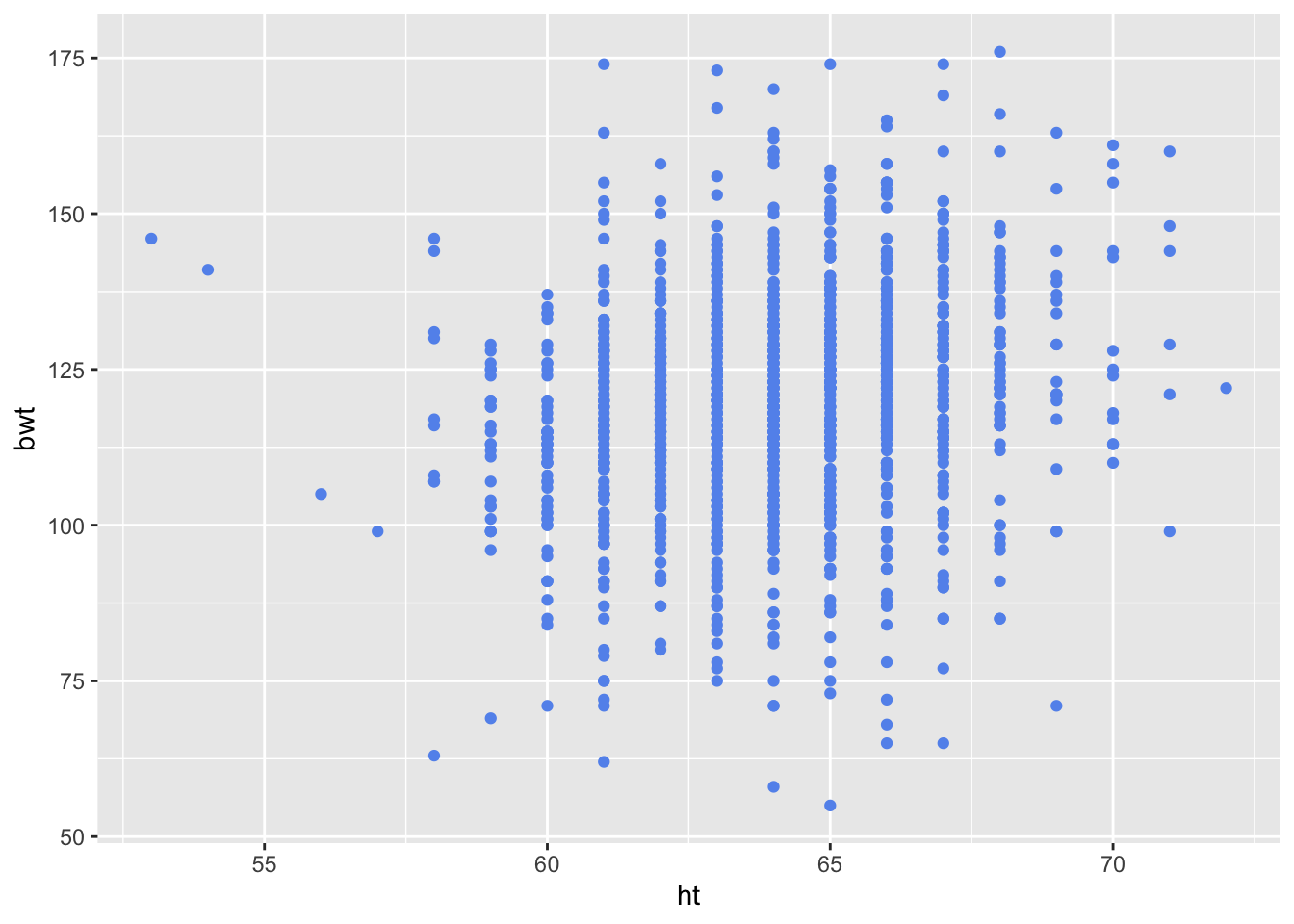
Depending on the value of geom and stat, we can pass additional parameters to control the appearance of the geom or the statistics function. In the above example, we simply want to change the color of the points and remove the NA values so we set params to a list with named na.rm and color elements. The position argument specifies how to handle over plotting. The value ‘identity’ indicates that we are not jittering or performing any sort of repositioning to address over plotting.