Lattice Plots
1 Customizing the Panel Function
One of the basic concepts of lattice plots is the idea of a panel. Each
separate graph that is displayed in a multi-plot lattice graph is known as
a panel, and for each of the basic types of lattice plots, there's a function
called panel.plottype, where plottype is the type of plot
in question. For example, the function that actually produces the individual
plots for xyplot is called panel.xyplot. To do something
special inside the panels, you can pass your own panel function to the
lattice plotting routines using the panel= argument. Generally,
the first thing such a function would do is to call the default panel plotting
routine; then additional operations can be performed with functions
like panel.points, panel.lines, panel.text. (See
the help page for panel.functions to see some other possibilities.)
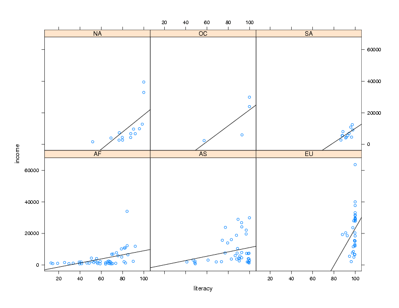
For example, in the income versus literacy plot, we might want to show the
best regression line that goes through the points for each continent, using
the panel.lmline function. Here's how we could construct and call
a custom panel function:
> mypanel = function(x,y,...){
+   panel.xyplot(x,y,...)
+   panel.lmline(x,y)
+ }
xyplot(income ~ literacy | cont,data=world,panel=mypanel)
The plot is shown below.
 By default, the lattice functions display their panels from bottom to top
and left to right, similar to the way points are drawn on a scatterplot.
If you'd like the plots to be displaying going from top to bottom, use the
as.table=TRUE argument to any of the lattice plotting functions.
Now that we've seen some of the basics of how the lattice library routines
work, we'll take a look at some of the functions that are available. Remember
that there are usually similar alternatives available among the traditional
graphics functions, so you can think of these as additional choices that are
available, and not necessarily the only possibility for producing a particular
type of plot.
By default, the lattice functions display their panels from bottom to top
and left to right, similar to the way points are drawn on a scatterplot.
If you'd like the plots to be displaying going from top to bottom, use the
as.table=TRUE argument to any of the lattice plotting functions.
Now that we've seen some of the basics of how the lattice library routines
work, we'll take a look at some of the functions that are available. Remember
that there are usually similar alternatives available among the traditional
graphics functions, so you can think of these as additional choices that are
available, and not necessarily the only possibility for producing a particular
type of plot.
2 Univariate Displays
Univariate displays are plots that are concerned with the
distribution of a single variable,
possibly comparing the distribution among several subsamples of the
data. They are especially useful when you are first getting acquainted
with a data set, since you may be able to identify outliers or other
problems that could get masked by more complex displays or analyses.
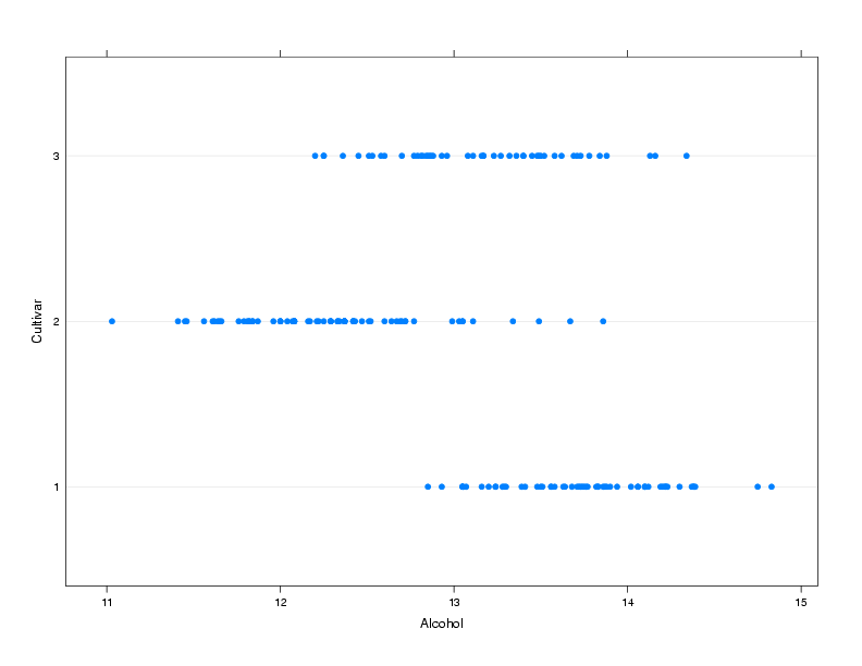
2.1 dotplot
A simple but surprisingly useful display for small to moderate amounts of
univariate data is the dotplot. Each observation's value for a variable
is plotted as a dot along a line that spans the range of the variable's
value. In the usual case, there will be several such lines, one for each
level of a grouping variable, making it very easy to spot differences
in the variable's distribution for different groups.
To illustrate, we'll use a a data set from a wine recognition experiment where
a number of chemical and other measurements were taken on wines from three
cultivars.
The data is available at http://www.stat.berkeley.edu/~spector/s133/data/wine.data; information about
the variables is at http://www.stat.berkeley.edu/~spector/s133/data/wine.names
Suppose we are interested in comparing the alcohol
level of wines from the three different cultivars:
> wine = read.csv('http://www.stat.berkeley.edu/~spector/s133/data/wine.data',header=FALSE)
> names(wine) = c("Cultivar", "Alcohol", "Malic.acid", "Ash", "Alkalinity.ash",
+                 "Magnesium", "Phenols", "Flavanoids", "NF.phenols", "Proanthocyanins",
+                 "Color.intensity","Hue","OD.Ratio","Proline")
> wine$Cultivar = factor(wine$Cultivar)
> dotplot(Cultivar~Alcohol,data=wine,ylab='Cultivar')
The plot is shown below.
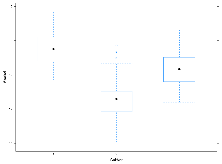
2.2 bwplot
The bwplot produces box/whisker plots. Unfortunately, notched
boxplots are not currently available using bwplot. To create
a box/whisker plot of Alcohol for the three cultivars, we can use
the same formula we passed to dotplot:
> bwplot(Alcohol~Cultivar,data=wine,xlab='Cultivar',ylab='Alcohol')
The plot is shown below.
 For both dotplot and bwplot, if you switch the roles of
the variables in the formula, the orientation of the plot will change. In
other words, the lines in the dotplot will be displayed vertically instead
of horizontally, and the boxplots will be displayed horizontally instead
of vertically.
For both dotplot and bwplot, if you switch the roles of
the variables in the formula, the orientation of the plot will change. In
other words, the lines in the dotplot will be displayed vertically instead
of horizontally, and the boxplots will be displayed horizontally instead
of vertically.
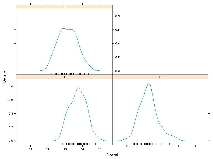
2.3 densityplot
As its name implies, this function produces smoothed plots of densities,
similar to passing a call to the density function to the plot
function. To compare multiple groups, it's best to create a conditioning
plot:
> densityplot(~Alcohol|Cultivar,data=wine)
Notice that, for plots like this, the formula doesn't have a left hand
side. The plot is shown below:
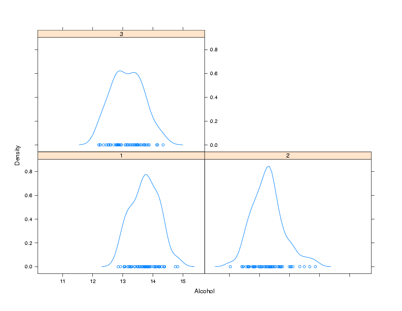 As another example of a custom panel function, suppose we wanted to
eliminate the points that are plotted near the x-axis and replace them
with what is known as a rug - a set of tickmarks pointing up from the
x-axis that show where the observations were. In practice, many people
simply define panel functions like this on the fly. After consulting
the help pages for panel.densityplot and panel.rug,
we could replace the points
with a rug as follows:
As another example of a custom panel function, suppose we wanted to
eliminate the points that are plotted near the x-axis and replace them
with what is known as a rug - a set of tickmarks pointing up from the
x-axis that show where the observations were. In practice, many people
simply define panel functions like this on the fly. After consulting
the help pages for panel.densityplot and panel.rug,
we could replace the points
with a rug as follows:
> densityplot(~Alcohol|Cultivar,data=wine,panel=function(x,...){
+                              panel.densityplot(x,plot.points=FALSE)
+                              panel.rug(x=x)
+                              })
Of course, if you find it easier or more convenient to define a custom
panel function separate from the call to the plotting function, you can
use that method. Here's the result:
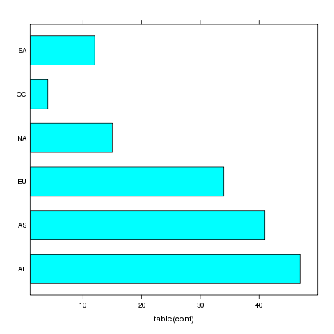
3 barchart
A bar chart is like a histogram for categorical data. The barchart
function expects its input data frame to already have the numbers of
observations for each grouping tabulated. For the simplest case of a single
variable with no conditioning variable, you can use a call to table
on the right hand side of the tilda to produce a vertical bar chart:
> barchart(~table(cont),data=world)
The plot is shown below.
 For more complex barcharts, a data frame containing the counts to be plotted
needs to be constructed. This can be done easily using the table
in conjunction with as.data.frame. To illustrate, we'll return to
the movies data set which has the release dates and box office receipts for
some of the all-time most popular movies. Suppose we want to see if the
distribution of the day of the week the movies opened on has changed over
time. First, we'll read the data and create a grouping variable for different
time periods:
For more complex barcharts, a data frame containing the counts to be plotted
needs to be constructed. This can be done easily using the table
in conjunction with as.data.frame. To illustrate, we'll return to
the movies data set which has the release dates and box office receipts for
some of the all-time most popular movies. Suppose we want to see if the
distribution of the day of the week the movies opened on has changed over
time. First, we'll read the data and create a grouping variable for different
time periods:
> movies = read.delim('http://www.stat.berkeley.edu/~spector/s133/data/movies.txt',as.is=TRUE,sep='|')
> movies$box = as.numeric(sub('\\$','',movies$box))
> movies$date = as.Date(movies$date,'%B %d, %Y')
> movies$year = as.numeric(format(movies$date,'%Y'))
> movies$weekday = factor(weekdays(movies$date),
+        levels=c('Monday','Tuesday','Wednesday','Thursday','Friday','Saturday','Sunday'))
> movies$yrgrp = cut(movies$year,c(1936,1980,1985,1990,1995,2000,2006),
+        labels=c('1937-1979','1980-1984','1985-1990','1991-1995','1996-2000','2001-2005'))
> counts = as.data.frame(table(yrgrp=movies$yrgrp,weekday=movies$weekday))
> barchart(Freq~weekday|yrgrp,data=counts,scales=list(rot=c(90,0)),as.table=TRUE)
The plot is shown below.
 If the roles of Freq and weekday were reversed in the
previous call to barchart, the bars would be drawn horizontally
instead of vertically.
If the roles of Freq and weekday were reversed in the
previous call to barchart, the bars would be drawn horizontally
instead of vertically.
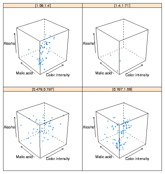
4 3-D Plots: cloud
The three-dimensional analog of the two-dimensional xyplot in the
lattice library is cloud. By using a conditioning variable,
cloud can allow us to consider the relationship of four variables
at once. To illustrate, here's conditioning plot showing the relationship
among four variables from the wine data frame:
cloud(Alcohol ~ Color.intensity + Malic.acid|cut(Hue,4),data=wine)
The plot is shown below:
File translated from
TEX
by
TTH,
version 3.67.
On 3 Mar 2009, 16:53.