Performing and Interpreting Cluster Analysis
As an example of using the agnes function from the cluster package,
consider the famous Fisher iris data, available as the dataframe iris in R.
First let's look at some of the data:
> head(iris)
  Sepal.Length Sepal.Width Petal.Length Petal.Width Species
1          5.1         3.5          1.4         0.2  setosa
2          4.9         3.0          1.4         0.2  setosa
3          4.7         3.2          1.3         0.2  setosa
4          4.6         3.1          1.5         0.2  setosa
5          5.0         3.6          1.4         0.2  setosa
6          5.4         3.9          1.7         0.4  setosa
We will only consider the numeric variables in the cluster analysis.
As mentioned previously, there are two functions to compute the
distance matrix: dist and daisy. It should be
mentioned that for data that's all numeric, using the function's
defaults, the two methods will give the same answers. We can
demonstrate this as follows:
> iris.use = subset(iris,select=-Species)
> d = dist(iris.use)
> library(cluster)
> d1 = daisy(iris.use)
> sum(abs(d - d1))
[1] 1.072170e-12
Of course, if we choose a non-default metric for
dist, the answers will be different:
> dd = dist(iris.use,method='manhattan')
> sum(abs(as.matrix(dd) - as.matrix(d1)))
[1] 38773.86
The values are very different!
Continuing with the cluster example, we can calculate
the cluster solution as follows:
> z = agnes(d)
The plotting method for agnes objects presents two
different views of the cluster solution. When we plot such
an object, the plotting function sets the graphics
parameter ask=TRUE, and the following appears in your
R session each time a plot is to be drawn:
Hit <Return> to see next plot:
If you know you want a particular plot, you can pass the
which.plots= argument an integer telling which
plot you want.
The first plot that is displayed is known as a banner plot.
The banner plot for the iris data is shown below:
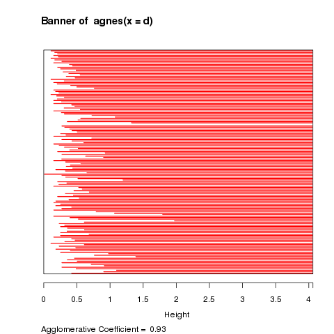 The white area on the left of the banner plot represents the
unclustered data while the white lines that stick into the
red are show the heights at which the clusters were formed.
Since we don't want to include too many clusters that joined
together at similar heights, it looks like three clusters,
at a height of about 2 is a good solution. It's clear from
the banner plot that if we lowered the height to, say 1.5,
we'd create a fourth cluster with only a few observations.
The banner plot is just an alternative to the dendogram, which
is the second plot that's produced from an agnes object:
The white area on the left of the banner plot represents the
unclustered data while the white lines that stick into the
red are show the heights at which the clusters were formed.
Since we don't want to include too many clusters that joined
together at similar heights, it looks like three clusters,
at a height of about 2 is a good solution. It's clear from
the banner plot that if we lowered the height to, say 1.5,
we'd create a fourth cluster with only a few observations.
The banner plot is just an alternative to the dendogram, which
is the second plot that's produced from an agnes object:
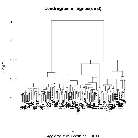 The dendogram shows the same relationships, and it's a matter
of individual preference as to which one is easier to use.
Let's see how well the clusters do in grouping the irises by species:
The dendogram shows the same relationships, and it's a matter
of individual preference as to which one is easier to use.
Let's see how well the clusters do in grouping the irises by species:
> table(cutree(z,3),iris$Species)

    setosa versicolor virginica
  1     50          0         0
  2      0         50        14
  3      0          0        36
We were able to classify all the setosa and versicolor varieties correctly.
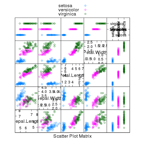
The following plot gives some insight into why we were so successful:
> splom(~iris,groups=iris$Species,auto.key=TRUE)
File translated from
TEX
by
TTH,
version 3.67.
On 16 Mar 2009, 14:54.