Analysis of Variance
1 More Complex Models
When working with the wine data frame,
we've separated the categorical variable (Cultivar) from the
continuous variable for pedagogical reasons, but the aov function
can accomodate both in the same model. Let's add the Cultivar
variable to the regression model we've previously worked with:
> wine.new = lm(Alcohol~Cultivar+Malic.acid+Alkalinity.ash+Proanthocyanins+Color.intensity+OD.Ratio+Proline,data=wine)
> summary(wine.new)

Call:
lm(formula = Alcohol ~ Cultivar + Malic.acid + Alkalinity.ash +
    Proanthocyanins + Color.intensity + OD.Ratio + Proline, data = wine)

Residuals:
     Min       1Q   Median       3Q      Max
-1.13591 -0.31737 -0.02623  0.33229  1.65633

Coefficients:
                  Estimate Std. Error t value Pr(>|t|)
(Intercept)     12.9158487  0.4711149  27.415  < 2e-16 ***
Cultivar2       -0.9957910  0.1776136  -5.607 8.26e-08 ***
Cultivar3       -0.6714047  0.2396380  -2.802  0.00568 **
Malic.acid       0.0559472  0.0410860   1.362  0.17510
Alkalinity.ash  -0.0133598  0.0134499  -0.993  0.32198
Proanthocyanins -0.0561493  0.0817366  -0.687  0.49305
Color.intensity  0.1135452  0.0270097   4.204 4.24e-05 ***
OD.Ratio         0.0494695  0.0987946   0.501  0.61721
Proline          0.0002391  0.0002282   1.048  0.29629
---
Signif. codes:  0 '***' 0.001 '**' 0.01 '*' 0.05 '.' 0.1 ' ' 1

Residual standard error: 0.4886 on 169 degrees of freedom
Multiple R-Squared: 0.6541,     Adjusted R-squared: 0.6377
F-statistic: 39.95 on 8 and 169 DF,  p-value: < 2.2e-16
One problem with the summary display for models like this is that
it's treating our factor variable (Cultivar) as two separate
variables. While that is the way it is fit in the model, it's usually
more informative to combine the effects of the two variables as a single
effect. The anova command will produce a more traditional
ANOVA table:
> anova(wine.new)
Analysis of Variance Table

Response: Alcohol
                 Df Sum Sq Mean Sq  F value    Pr(>F)
Cultivar          2 70.795  35.397 148.2546 < 2.2e-16 ***
Malic.acid        1  0.013   0.013   0.0552    0.8146
Alkalinity.ash    1  0.229   0.229   0.9577    0.3292
Proanthocyanins   1  0.224   0.224   0.9384    0.3341
Color.intensity   1  4.750   4.750  19.8942 1.488e-05 ***
OD.Ratio          1  0.031   0.031   0.1284    0.7206
Proline           1  0.262   0.262   1.0976    0.2963
Residuals       169 40.351   0.239
---
Signif. codes:  0 '***' 0.001 '**' 0.01 '*' 0.05 '.' 0.1 ' ' 1
The summary display contained other useful information, so you shouldn't
hesitate to look at both.
Comparing these results to our previous regression, we can see that only
one variable (Color.intensity) is still significant, and the
effect of Cultivar is very significant. For this data set, it
means that while we can use the chemical composition to help predict the
Alcohol content of the wines, but that knowing the Cultivar
will be more effective. Let's look at a reduced model that uses only
Cultivar and Color.intensity to see how it compares with
the model containing the extra variables:
> wine.new1 = lm(Alcohol~Cultivar+Color.intensity,data=wine)
> summary(wine.new1)

Call:
lm(formula = Alcohol ~ Cultivar + Color.intensity, data = wine)

Residuals:
     Min       1Q   Median       3Q      Max
-1.12074 -0.32721 -0.04133  0.34799  1.54962

Coefficients:
                Estimate Std. Error t value Pr(>|t|)
(Intercept)     13.14845    0.14871  88.417  < 2e-16 ***
Cultivar2       -1.20265    0.10431 -11.530  < 2e-16 ***
Cultivar3       -0.79248    0.10495  -7.551 2.33e-12 ***
Color.intensity  0.10786    0.02434   4.432 1.65e-05 ***
---
Signif. codes:  0 '***' 0.001 '**' 0.01 '*' 0.05 '.' 0.1 ' ' 1

Residual standard error: 0.4866 on 174 degrees of freedom
Multiple R-Squared: 0.6468,     Adjusted R-squared: 0.6407
F-statistic: 106.2 on 3 and 174 DF,  p-value: < 2.2e-16
The adjusted R-squared for this model is better than that of the previous
one, indicating that removing those extra variables didn't seem to
cause any problems. To formally test to see if there is a difference
between the two models, we can use the anova function. When passed
a single model object, anova prints an ANOVA table, but when it's passed
two model objects, it performs a test to compare the two models:
> anova(wine.new,wine.new1)
Analysis of Variance Table

Model 1: Alcohol ~ Cultivar + Malic.acid + Alkalinity.ash + Proanthocyanins +
    Color.intensity + OD.Ratio + Proline
    Model 2: Alcohol ~ Cultivar + Color.intensity
      Res.Df    RSS  Df Sum of Sq      F Pr(>F)
      1    169 40.351
      2    174 41.207  -5    -0.856 0.7174 0.6112
The test indicates that there's no significant difference between the two
models.
When all the independent variables in our model were categorical model (the
race/activity example),
the interactions between the categorical variables was one of the most
interesting parts of the analysis. What does an interaction between a
categorical variable and a continuous variable represent? Such an interaction
can tell us if the slope of the continuous variable is different for the
different levels of the categorical variable. In the current model, we can
test to see if the slopes are different by adding the term
Cultivar:Color.intensity to the model:
> anova(wine.new2)
Analysis of Variance Table

Response: Alcohol
                          Df Sum Sq Mean Sq  F value    Pr(>F)
Cultivar                   2 70.795  35.397 149.6001 < 2.2e-16 ***
Color.intensity            1  4.652   4.652  19.6613 1.644e-05 ***
Cultivar:Color.intensity   2  0.509   0.255   1.0766     0.343
Residuals                172 40.698   0.237
---
Signif. codes:  0 '***' 0.001 '**' 0.01 '*' 0.05 '.' 0.1 ' ' 1
There doesn't seem to be a significant interaction.
As another example, consider a data set with information about experience, gender,
and wages. Experience is recorded as number of years on the job, and gender is recorded
as 0 or 1. To see if the slope of the line relating experience to wages is different
for the two genders, we can proceed as follows:
> wages = read.delim('http://www.stat.berkeley.edu/~spector/s133/data/wages.tab')
> wages$gender = factor(wages$gender)
> wages.aov = aov(wage ~ experience*gender,data=wages)
> anova(wages.aov)
Analysis of Variance Table

Response: wage
                   Df  Sum Sq Mean Sq F value    Pr(>F)
experience          1   106.7  106.69  4.2821   0.03900 *
gender              1   635.8  635.78 25.5175 6.042e-07 ***
experience:gender   1   128.9  128.94  5.1752   0.02331 *
Residuals         530 13205.3   24.92
---
Signif. codes:  0 ‘***’ 0.001 ‘**’ 0.01 ‘*’ 0.05 ‘.’ 0.1 ‘ ’ 1
The significant probability value for experience:gender indicates
that the effect of experience on wages is different depending on the gender of the
employee. By performing two separate regressions, we can see the values for the
slopes for the different genders:
> coef(lm(wage experience,data=subset(wages,gender == 0)))
(Intercept)  experience
 8.62215280  0.08091533
> coef(lm(wage experience,data=subset(wages,gender == 1)))
(Intercept)  experience
7.857197368 0.001150118
This indicates that there is a small increase in wages as experience increases
for gender == 0, but virtually no increase for gender == 1.
2 Constructing Formulas
For the examples we've looked at, there weren't so many terms in the model that
it became tedious entering them by hand, but in models with many interactions
it can quickly become a nuisance to have to enter every term into the model.
When the terms are all main effects, you can often save typing by using a
data= argument specifying a data set with just the variables you are
interested in and using the period (.) as the right-hand side of the
model, but that will not automatically generate interactions.
The formula function will accept a text string containing a formula,
and convert it to a formula that can be passed to any of the modeling functions.
While it doesn't really make sense for the wine data, suppose we
wanted to add Cultivar and all the interactions between Cultivar
and the independent variables to our original regression model.
The first step is to create a vector of the variables we want to work with.
This can usually be done pretty easily using the names of the data frame
we're working with.
> vnames = names(wine)[c(3,5,10,11,13,14)]
For the main part of the model we need to join together these names with
plus signs (+):
> main = paste(vnames,collapse=' + ')
The interactions can be created by pasting together Cultivar
with each of the continuous variables, using a colon (:) as a
separator, and then joining them together with plus signs:
> ints = paste(paste('Cultivar',vnames,sep=':'),collapse=" + ")
Finally, we put the dependent variable and Cultivar into the model,
and paste everything together:
> mymodel = paste('Alcohol ~ Cultivar',main,ints,sep='+')
> mymodel
[1] "Alcohol ~ Cultivar+Malic.acid + Alkalinity.ash + Proanthocyanins + Color.intensity + OD.Ratio + Proline+Cultivar:Malic.acid + Cultivar:Alkalinity.ash + Cultivar:Proanthocyanins + Cultivar:Color.intensity + Cultivar:OD.Ratio + Cultivar:Proline"
To run this, we need to pass it to a modeling function through the formula
function:
> wine.big = aov(formula(mymodel),data=wine)
> anova(wine.big)
Analysis of Variance Table

Response: Alcohol
                          Df Sum Sq Mean Sq  F value    Pr(>F)
Cultivar                   2 70.795  35.397 154.1166 < 2.2e-16 ***
Malic.acid                 1  0.013   0.013   0.0573   0.81106
Alkalinity.ash             1  0.229   0.229   0.9955   0.31993
Proanthocyanins            1  0.224   0.224   0.9755   0.32483
Color.intensity            1  4.750   4.750  20.6808 1.079e-05 ***
OD.Ratio                   1  0.031   0.031   0.1335   0.71536
Proline                    1  0.262   0.262   1.1410   0.28708
Cultivar:Malic.acid        2  0.116   0.058   0.2524   0.77727
Cultivar:Alkalinity.ash    2  0.876   0.438   1.9071   0.15194
Cultivar:Proanthocyanins   2  1.176   0.588   2.5610   0.08045 .
Cultivar:Color.intensity   2  0.548   0.274   1.1931   0.30602
Cultivar:OD.Ratio          2  0.415   0.207   0.9024   0.40769
Cultivar:Proline           2  1.160   0.580   2.5253   0.08328 .
Residuals                157 36.060   0.230
---
Signif. codes:  0 '***' 0.001 '**' 0.01 '*' 0.05 '.' 0.1 ' ' 1
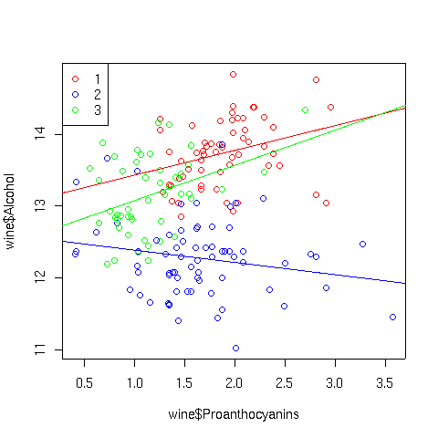
As expected there isn't anything too startling. If we wanted to investigate,
say, the Cultivar:Proanthocyanins interaction, we could look at a
scatter plot using separate colors for the points and corresponding best
regression lines for each Cultivar:
> plot(wine$Proanthocyanins,wine$Alcohol,col=c('red','blue','green')[wine$Cultivar])
> abline(lm(Alcohol~Proanthocyanins,data=wine,subset=Cultivar==1),col='red')
> abline(lm(Alcohol~Proanthocyanins,data=wine,subset=Cultivar==2),col='blue')
> abline(lm(Alcohol~Proanthocyanins,data=wine,subset=Cultivar==3),col='green')
> legend('topleft',legend=levels(wine$Cultivar),pch=1,col=c('red','blue','green'))
The plot appears below:
3 Alternatives for ANOVA
Not all data is suitable for ANOVA - in particular, if the variance
varies dramatically between different groups, the assumption of equal
variances is violated, and ANOVA results may not be valid. We've seen
before that log transformations often help with ratios or percentages,
but they may not always be effective.
As an example of a data set not suitable for ANOVA, consider the builtin
data set airquality which has daily measurements of ozone and other
quantities for a 153 day period. The question to be answered is whether
or not the average level of ozone is the same over the five months sampled.
On the surface, this data seems suitable for ANOVA, so let's examine
the diagnostic plots that would result from performing the ANOVA:
> airquality$Month = factor(airquality$Month)
> ozone.aov = aov(Ozone~Month,data=airquality)
> plot(ozone.aov)
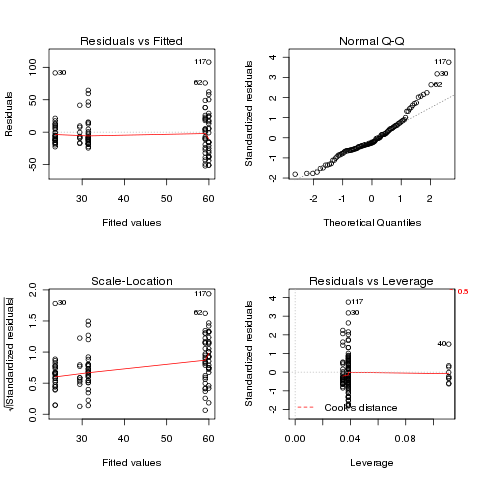 There are deviations at both the low and high ends of the Q-Q plot,
and some deviation from a constant in the Scale-Location plot. Will
a log transformation help?
There are deviations at both the low and high ends of the Q-Q plot,
and some deviation from a constant in the Scale-Location plot. Will
a log transformation help?
> ozonel.aov = aov(log(Ozone)~Month,data=airquality)
> plot(ozonel.aov)
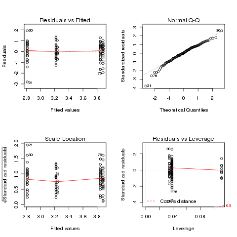 In this case, the transformation didn't really help.
It might
be possible to find a more suitable transformation, but we can also
use a statistical test that makes fewer assumptions about our data.
One such test is the Kruskal-Wallis test. Basically, the test replaces
the data with the ranks of the data, and performs an ANOVA on those
ranks. It assumes that observations are independent from each other,
but doesn't demand equality of variance across the groups, or that
the observations follow a normal distribution.
The kruskal.test function in R performs the test,
using the same formula interface as aov.
In this case, the transformation didn't really help.
It might
be possible to find a more suitable transformation, but we can also
use a statistical test that makes fewer assumptions about our data.
One such test is the Kruskal-Wallis test. Basically, the test replaces
the data with the ranks of the data, and performs an ANOVA on those
ranks. It assumes that observations are independent from each other,
but doesn't demand equality of variance across the groups, or that
the observations follow a normal distribution.
The kruskal.test function in R performs the test,
using the same formula interface as aov.
> ozone.kruskal = kruskal.test(Ozone~Month,data=airquality)
> ozone.kruskal

	Kruskal-Wallis rank sum test

data:  Ozone by Month
Kruskal-Wallis chi-squared = 29.2666, df = 4, p-value = 6.901e-06
All that's reported is the significance level for the test, which tells
us that the differences between the Ozone levels for different months
is very significant. To see where the differences come from, we can
use the kruskalmc function in the strangely-named pgirmess
package. Unfortunately this function doesn't use the model interface -
you simply provide the response variable and the (factor) grouping variable.
> library(pgirmess)
> kruskalmc(airquality$Ozone,airquality$Month)
Multiple comparison test after Kruskal-Wallis
p.value: 0.05
Comparisons
      obs.dif critical.dif difference
5-6 57.048925     31.85565       TRUE
5-7 38.758065     31.59346       TRUE
5-8 37.322581     31.59346       TRUE
5-9  2.198925     31.85565      FALSE
6-7 18.290860     31.85565      FALSE
6-8 19.726344     31.85565      FALSE
6-9 54.850000     32.11571       TRUE
7-8  1.435484     31.59346      FALSE
7-9 36.559140     31.85565       TRUE
8-9 35.123656     31.85565       TRUE
Studying these results shows that months 6,7, and 8 are
very similar, but different from months 5 and 9.
To understand why this data is not suitable for ANOVA, we can
look at boxplots of the Ozone levels for each month:
> boxplot(with(airquality,split(Ozone,Month)))
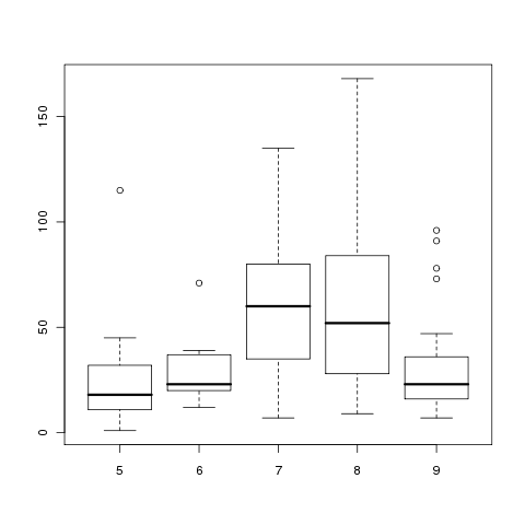 The variances are clearly not equal across months, and the
lack of symmetry for months 5 and 6 brings the normal assumption
into doubt.
The variances are clearly not equal across months, and the
lack of symmetry for months 5 and 6 brings the normal assumption
into doubt.
File translated from
TEX
by
TTH,
version 3.67.
On 30 Apr 2010, 13:24.