Analysis of Variance
1 Multiple Comparisons
In the previous example, notice that the test for Cultivar
is simply answering the question "Are there any significant differences
among the cultivars?". This is because the F-test which is used
to determine significant is based on the two different ways of
calculating the variance, not on any particular differences among
the means.
Having seen that there is a significant effect for Cultivar
in the previous example, a natural questions is "Which cultivars
are different from each other". One possibility would be to look
at all possible t-tests between the levels of the cultivar, i.e.
do t-tests for 1 vs. 2, 1 vs. 3, and 2 vs. 3. This is a very bad idea
for at least two reasons:
- One of the main goals of ANOVA is to combine together all our data,
so that we can more accurately estimate the residual variance of our
model. In the previous example, notice that there were 175 degrees
of freedom used to estimate the residual variance. Under the assumptions
of ANOVA, the variance of the dependent variable doesn't change across
the different levels of the independent variables, so we can (and should)
use the estimate from the ANOVA for all our tests. When we use a t-test,
we'll be estimating the residual variance only using the observations
for the two groups we're comparing, so we'll have fewer degrees of
freedom, and less power in determining differences.
-
When we're comparing several groups using t-tests, we have to look at
all possible combinations among the groups. This will sometimes result
in many tests, and we can no longer be confident that the probability
level we use for the individual tests will hold up across all of those
comparisons we're making. This is a well-known problem in statistics,
and many techniques have been developed to adjust probability values to
handle this case. However, these techniques tend to be quite conservative,
and they may prevent us from seeing differences that really exist.
To see how probabilities get adjusted when many comparisons are made,
consider a data set on the nitrogen levels in 5 varieties of clover.
We wish to test the hypothesis that the nitrogen level of the different
varieties of clover is the same.
> clover = read.table('http://www.stat.berkeley.edu/~spector/s133/data/clover.txt',header=TRUE)
> clover.aov = aov(Nitrogen~Strain,data=clover)
> summary(clover.aov)
            Df Sum Sq Mean Sq F value    Pr(>F)
Strain       5 847.05  169.41  14.370 1.485e-06 ***
Residuals   24 282.93   11.79
---
Signif. codes:  0 ‘***’ 0.001 ‘**’ 0.01 ‘*’ 0.05 ‘.’ 0.1 ‘ ’ 1
Let's say that we want to look at all the possible t-tests
among pairs of the 6 strains. First, we can use the combn
function to show us all the possible 2-way combinations of the strains:
> combs = combn(as.character(unique(clover$Strain)),2)
> combs
     [,1]    [,2]    [,3]    [,4]     [,5]     [,6]    [,7]    [,8]
[1,] "3DOK1" "3DOK1" "3DOK1" "3DOK1"  "3DOK1"  "3DOK5" "3DOK5" "3DOK5"
[2,] "3DOK5" "3DOK4" "3DOK7" "3DOK13" "COMPOS" "3DOK4" "3DOK7" "3DOK13"
     [,9]     [,10]   [,11]    [,12]    [,13]    [,14]    [,15]
[1,] "3DOK5"  "3DOK4" "3DOK4"  "3DOK4"  "3DOK7"  "3DOK7"  "3DOK13"
[2,] "COMPOS" "3DOK7" "3DOK13" "COMPOS" "3DOK13" "COMPOS" "COMPOS"
Let's focus on the first column:
> x = combs[,1]
> tt = t.test(Nitrogen~Strain,data=clover)
> names(tt)
[1] "statistic"   "parameter"   "p.value"     "conf.int"    "estimate"
[6] "null.value"  "alternative" "method"      "data.name"
This suggests a function which would return the probability
for each combination of cars:
> gettprob = function(x)t.test(Nitrogen~Strain,data=clover[clover$Strain %in% x,])$p.value
We can get the probabilities for all the tests, and combine them with
the country names for display:
> probs = data.frame(t(combs),probs=apply(combs,2,gettprob))
> probs
       X1     X2        probs
1   3DOK1  3DOK5 1.626608e-01
2   3DOK1  3DOK4 2.732478e-03
3   3DOK1  3DOK7 2.511696e-02
4   3DOK1 3DOK13 3.016445e-03
5   3DOK1 COMPOS 1.528480e-02
6   3DOK5  3DOK4 5.794178e-03
7   3DOK5  3DOK7 7.276336e-02
8   3DOK5 3DOK13 1.785048e-03
9   3DOK5 COMPOS 3.177169e-02
10  3DOK4  3DOK7 4.331464e-02
11  3DOK4 3DOK13 5.107291e-01
12  3DOK4 COMPOS 9.298460e-02
13  3DOK7 3DOK13 4.996374e-05
14  3DOK7 COMPOS 2.055216e-01
15 3DOK13 COMPOS 4.932466e-04
These probabilities are for the individual t-tests, each with
an alpha level of 0.05, but that doesn't guarantee that the experiment-wise
alpha will be .05. We can use the p.adjust function to adjust
these probabilities:
> probs = data.frame(probs,adj.prob=p.adjust(probs$probs,method='bonferroni'))
> probs
       X1     X2        probs    adj.prob
1   3DOK1  3DOK5 1.626608e-01 1.000000000
2   3DOK1  3DOK4 2.732478e-03 0.040987172
3   3DOK1  3DOK7 2.511696e-02 0.376754330
4   3DOK1 3DOK13 3.016445e-03 0.045246679
5   3DOK1 COMPOS 1.528480e-02 0.229272031
6   3DOK5  3DOK4 5.794178e-03 0.086912663
7   3DOK5  3DOK7 7.276336e-02 1.000000000
8   3DOK5 3DOK13 1.785048e-03 0.026775721
9   3DOK5 COMPOS 3.177169e-02 0.476575396
10  3DOK4  3DOK7 4.331464e-02 0.649719553
11  3DOK4 3DOK13 5.107291e-01 1.000000000
12  3DOK4 COMPOS 9.298460e-02 1.000000000
13  3DOK7 3DOK13 4.996374e-05 0.000749456
14  3DOK7 COMPOS 2.055216e-01 1.000000000
15 3DOK13 COMPOS 4.932466e-04 0.007398699
Notice that many of the comparisons that seemed significant when
using the t-test are no longer significant. Plus, we didn't take
advantage of the increased degrees of freedom. One technique that
uses all the degrees of freedom of the combined test, while still
correcting for the problem of multiple comparisons is known as
Tukey's Honestly Significant Difference (HSD) test. The TukeyHSD
function takes a model object and the name of a factor, and provides
protected probability values for all the two-way comparisons of factor
levels. Here's the output of TukeyHSD for the clover data:
> tclover = TukeyHSD(clover.aov,'Strain')
> tclover
  Tukey multiple comparisons of means
    95% family-wise confidence level

Fit: aov(formula = Nitrogen ~ Strain, data = clover)

$Strain
                diff          lwr       upr     p adj
3DOK13-3DOK1  -15.56 -22.27416704 -8.845833 0.0000029
3DOK4-3DOK1   -14.18 -20.89416704 -7.465833 0.0000128
3DOK5-3DOK1    -4.84 -11.55416704  1.874167 0.2617111
3DOK7-3DOK1    -8.90 -15.61416704 -2.185833 0.0048849
COMPOS-3DOK1  -10.12 -16.83416704 -3.405833 0.0012341
3DOK4-3DOK13    1.38  -5.33416704  8.094167 0.9870716
3DOK5-3DOK13   10.72   4.00583296 17.434167 0.0006233
3DOK7-3DOK13    6.66  -0.05416704 13.374167 0.0527514
COMPOS-3DOK13   5.44  -1.27416704 12.154167 0.1621550
3DOK5-3DOK4     9.34   2.62583296 16.054167 0.0029837
3DOK7-3DOK4     5.28  -1.43416704 11.994167 0.1852490
COMPOS-3DOK4    4.06  -2.65416704 10.774167 0.4434643
3DOK7-3DOK5    -4.06 -10.77416704  2.654167 0.4434643
COMPOS-3DOK5   -5.28 -11.99416704  1.434167 0.1852490
COMPOS-3DOK7   -1.22  -7.93416704  5.494167 0.9926132

> class(tclover)
[1] "multicomp" "TukeyHSD"
> names(tclover)
[1] "Strain"
> class(tclover$Strain)
[1] "matrix"
These probabilities seem more reasonable. To combine these
results with the previous ones, notice that tclover$Strain
is a matrix, with row names indicating the comparisons being made.
We can put similar row names on our earlier results and then merge
them:
> row.names(probs) = paste(probs$X2,probs$X1,sep='-')
> probs = merge(probs,tclover$Strain[,'p adj',drop=FALSE],by=0)
> probs
       Row.names     X1     X2        probs    adj.prob        p adj
1   3DOK13-3DOK1  3DOK1 3DOK13 0.0030164452 0.045246679 2.888133e-06
2    3DOK4-3DOK1  3DOK1  3DOK4 0.0027324782 0.040987172 1.278706e-05
3    3DOK5-3DOK1  3DOK1  3DOK5 0.1626608271 1.000000000 2.617111e-01
4    3DOK7-3DOK1  3DOK1  3DOK7 0.0251169553 0.376754330 4.884864e-03
5    3DOK7-3DOK4  3DOK4  3DOK7 0.0433146369 0.649719553 1.852490e-01
6    3DOK7-3DOK5  3DOK5  3DOK7 0.0727633570 1.000000000 4.434643e-01
7   COMPOS-3DOK1  3DOK1 COMPOS 0.0152848021 0.229272031 1.234071e-03
8  COMPOS-3DOK13 3DOK13 COMPOS 0.0004932466 0.007398699 1.621550e-01
9   COMPOS-3DOK4  3DOK4 COMPOS 0.0929845957 1.000000000 4.434643e-01
10  COMPOS-3DOK5  3DOK5 COMPOS 0.0317716931 0.476575396 1.852490e-01
11  COMPOS-3DOK7  3DOK7 COMPOS 0.2055215679 1.000000000 9.926132e-01
Finally, we can display the probabilities without scientific
notation as follows:
> format(probs,scientific=FALSE)
       Row.names     X1     X2        probs    adj.prob          p adj
1   3DOK13-3DOK1  3DOK1 3DOK13 0.0030164452 0.045246679 0.000002888133
2    3DOK4-3DOK1  3DOK1  3DOK4 0.0027324782 0.040987172 0.000012787061
3    3DOK5-3DOK1  3DOK1  3DOK5 0.1626608271 1.000000000 0.261711120046
4    3DOK7-3DOK1  3DOK1  3DOK7 0.0251169553 0.376754330 0.004884863746
5    3DOK7-3DOK4  3DOK4  3DOK7 0.0433146369 0.649719553 0.185248969392
6    3DOK7-3DOK5  3DOK5  3DOK7 0.0727633570 1.000000000 0.443464260597
7   COMPOS-3DOK1  3DOK1 COMPOS 0.0152848021 0.229272031 0.001234070633
8  COMPOS-3DOK13 3DOK13 COMPOS 0.0004932466 0.007398699 0.162154993324
9   COMPOS-3DOK4  3DOK4 COMPOS 0.0929845957 1.000000000 0.443464260597
10  COMPOS-3DOK5  3DOK5 COMPOS 0.0317716931 0.476575396 0.185248969392
11  COMPOS-3DOK7  3DOK7 COMPOS 0.2055215679 1.000000000 0.992613208547
By using all of the data to estimate the residual error,
Tukey's HSD method actually reports some of the probabilities as
even lower than the t-tests.
2 Two-Way ANOVA
To express the idea of an interaction in the R modeling language, we need to
introduce two new operators. The colon (:) is used to indicate an
interaction between two or more variables in model formula. The asterisk
(*) is use to indicate all main effects and interactions among the
variables that it joins. So, for example the term A*B would expand
to the three terms A, B, and A:B. As an example
of a two-way ANOVA, consider a study to determine the effects of physical
activity on obesity. Subjects were rated for their physical activity on a
three point scale with 1=not very active, 2=somewhat active, and 3=very active.
In addition, the race (either 1 or 2) of the participant was recorded, along
with their Body Mass Index (BMI). We want
to answer the
following three questions:
- Were the means for BMI the same for the two races?
-
Were the means for BMI the same for the three activity levels?
-
Is the effect of activity level different depending on race?, or
equivalently Is the effect of race different depending on activity level?
The first two questions can be answered by looking at the race and
activity main effects, while the third question describes the
race by activity interaction. The data can be found at
http://www.stat.berkeley.edu/~spector/s133/data/activity.csv. Here are the R statements to run
the ANOVA:
> activity = read.csv('activity.csv')
> activity$race = factor(activity$race)
> activity$activity = factor(activity$activity)
> activity.aov = aov(bmi~race*activity,data=activity)
> summary(activity.aov)
                Df Sum Sq Mean Sq  F value  Pr(>F)
race             1   3552    3552 102.5894 < 2e-16 ***
activity         2   2672    1336  38.5803 < 2e-16 ***
race:activity    2    301     151   4.3508 0.01303 *
Residuals     1865  64574      35
---
Signif. codes:  0 '***' 0.001 '**' 0.01 '*' 0.05 '.' 0.1 ' ' 1
Notice that there are two degrees of freedom for activity - this means
two parameters will be estimated in order to explain activity's effect on
bmi. Unlike linear regression, where only a single parameter is
estimated, and the only relationship that can be fit is a linear one, using two
parameters (to account for the three levels of activity) provides more flexibility
than would be possible with linear regression.
To see if the analysis was reasonable, we can look at the default plots:
> plot(activity.aov)
The graphs appear below:
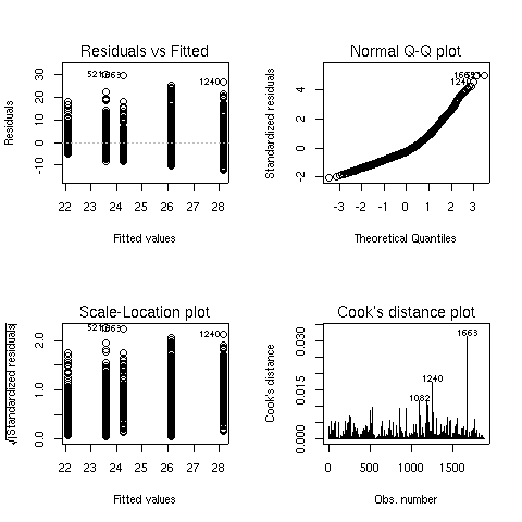 There seems to some deviation from normality when looking at
the Normal Q-Q plot (recall that, if the residuals did follow a normal
distribution, we would see a straight line.) When this situation arises,
analyzing the logarithm of the dependent variable often helps. Here are the
same results for the analysis of log(bmi):
There seems to some deviation from normality when looking at
the Normal Q-Q plot (recall that, if the residuals did follow a normal
distribution, we would see a straight line.) When this situation arises,
analyzing the logarithm of the dependent variable often helps. Here are the
same results for the analysis of log(bmi):
> activity1.aov = aov(log(bmi)~race*activity,data=activity)
> summary(activity1.aov)
                Df Sum Sq Mean Sq  F value    Pr(>F)
race             1  4.588   4.588 100.3741 < 2.2e-16 ***
activity         2  3.251   1.625  35.5596  6.98e-16 ***
race:activity    2  0.317   0.158   3.4625   0.03155 *
Residuals     1865 85.240   0.046
---
Signif. codes:  0 '***' 0.001 '**' 0.01 '*' 0.05 '.' 0.1 ' ' 1
> plot(activity1.aov)
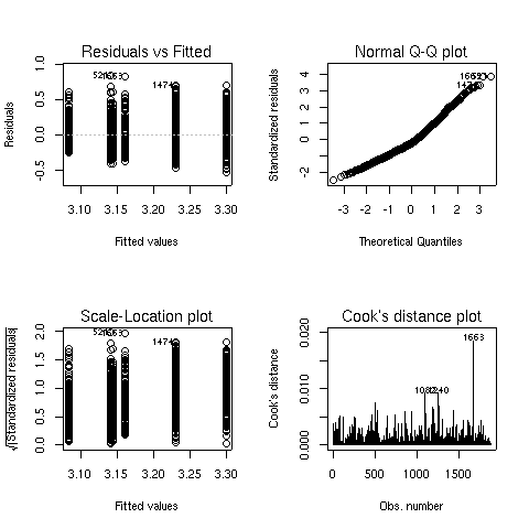 The Q-Q plot looks better, so this model is probably more appropriate.
We can see both main effects as well as the interaction are significant.
To see what's happening with the main effects, we can use aggregate:
The Q-Q plot looks better, so this model is probably more appropriate.
We can see both main effects as well as the interaction are significant.
To see what's happening with the main effects, we can use aggregate:
> aggregate(log(activity$bmi),activity['race'],mean)
  race        x
1    1 3.122940
2    2 3.222024
> aggregate(log(activity$bmi),activity['activity'],mean)
  activity        x
1        1 3.242682
2        2 3.189810
3        3 3.109518
Race 2 has higher values of BMI than race 1, and BMI decreases as the
level of activity increases.
To study the interaction, we could use aggregate, passing both race
and activity as the second argument:
> aggregate(log(activity$bmi),activity[c('race','activity')],mean)
  race activity        x
1    1        1 3.161119
2    2        1 3.298576
3    1        2 3.140970
4    2        2 3.230651
5    1        3 3.084426
6    2        3 3.143478
The arrangement of the output from tapply may be more helpful:
> tapply(log(activity$bmi),activity[c('race','activity')],mean)
    activity
race        1        2        3
   1 3.161119 3.140970 3.084426
   2 3.298576 3.230651 3.143478
It's usually difficult to judge relationships like this from a table.
One useful tool in this case is
an interaction plot. An interaction plot has one point
for each combination of the factors defined by an interaction. The x-axis
represents the levels of one of the factors, and the y-axis represents the
mean of the dependent variable, and a separate line is drawn for each
level of the factor not represented on the x-axis. While it wouldn't be
too hard to produce such a plot with basic commands in R, the process is
automated by the interaction.plot function. The first argument to
this function is the factor to appear on the x-axis; the second is the
factor which will define the multiple lines being drawn, and the third
argument is the dependent variable. By default, interaction.plot
uses the mean for its display, but you can provide a function of your own
choosing through the fun= argument.
For the activity data, we can produce an interaction plot with the following
code:
> with(activity,interaction.plot(activity,race,log(bmi)))
Here's the plot:
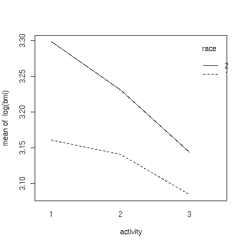 It can be seen that the interaction is due to the fact that the slope of
the line for race 2 is steeper than the line for race 1.
It can be seen that the interaction is due to the fact that the slope of
the line for race 2 is steeper than the line for race 1.
3 Another Example
This example has to do with iron retention in mice. Two different treatments,
each at three different levels, were fed to mice. The treatments were
tagged with radioactive iron, so that the percentage of iron retained could
be measured after a fixed period of time.
The data is presented in a table as follows:
----------------------------------------------------
         Fe2+                            Fe3+
----------------------------------------------------
high   medium   low       high    medium      low
----------------------------------------------------
0.71    2.20    2.25      2.20      4.04      2.71
1.66    2.93    3.93      2.69      4.16      5.43
2.01    3.08    5.08      3.54      4.42      6.38
2.16    3.49    5.82      3.75      4.93      6.38
2.42    4.11    5.84      3.83      5.49      8.32
2.42    4.95    6.89      4.08      5.77      9.04
2.56    5.16    8.50      4.27      5.86      9.56
2.60    5.54    8.56      4.53      6.28     10.01
3.31    5.68    9.44      5.32      6.97     10.08
3.64    6.25   10.52      6.18      7.06     10.62
3.74    7.25   13.46      6.22      7.78     13.80
3.74    7.90   13.57      6.33      9.23     15.99
4.39    8.85   14.76      6.97      9.34     17.90
4.50   11.96   16.41      6.97      9.91     18.25
5.07   15.54   16.96      7.52     13.46     19.32
5.26   15.89   17.56      8.36     18.40     19.87
8.15   18.30   22.82     11.65     23.89     21.60
8.24   18.59   29.13     12.45     26.39     22.25
----------------------------------------------------
Thus, before we can perform analysis on the data, it needs
to be rearranged. To do this, we can use the reshape
function. Since there are two different sets of variables
that represent the change in the factors of the experiment,
we first read in the data (skipping the header), and create
two groups of variables in our call to reshape:
> iron0 = read.table('iron.txt',skip=5,nrows=18)
> names(iron0) = c('Fe2high','Fe2medium','Fe2low','Fe3high','Fe3medium','Fe3low')
> iron1 = reshape(iron0,varying=list(1:3,4:6),direction='long')
> head(iron1)
    time Fe2high Fe3high id
1.1    1    0.71    2.20  1
2.1    1    1.66    2.69  2
3.1    1    2.01    3.54  3
4.1    1    2.16    3.75  4
5.1    1    2.42    3.83  5
6.1    1    2.42    4.08  6
After examining the data, it can be seen that the low, medium, and
high values have been translated into values 1, 2, and 3 in the
variable time. The id variable is created to help us see
which line each observation came from, which is not relevant in this
case, since the table was just used to present the data, and the
values in the table don't represent repeated measures on the same
experimental unit.
Next, we eliminate the id column, rename the column named
"time and further reshape the
data to represent the two treatments:
> iron1$id = NULL
> names(iron1)[1] = 'level'
> iron = reshape(iron1,varying=list(2:3),direction='long')
> head(iron)
    level time Fe2high id
1.1     1    1    0.71  1
2.1     1    1    1.66  2
3.1     1    1    2.01  3
4.1     1    1    2.16  4
5.1     1    1    2.42  5
6.1     1    1    2.42  6
All that's left is to remove the id
column and to rename time and Fe2high:
> iron$id = NULL
> names(iron)[2:3] = c('treatment','retention')
> head(iron)
    level treatment retention
1.1     1         1      0.71
2.1     1         1      1.66
3.1     1         1      2.01
4.1     1         1      2.16
5.1     1         1      2.42
6.1     1         1      2.42
Once the data has been reshaped, it's essential to
make sure that the independent variables are correctly stored
as factors:
> sapply(iron,class)
    level treatment retention
"integer" "integer" "numeric"
Since treatment and level are not factors,
we must convert them:
>  iron$treatment = factor(iron$treatment,labels=c('Fe2+','Fe3+'))
> iron$level = factor(iron$level,labels=c('high','medium','low'))
> head(iron)
    level treatment retention
1.1  high      Fe2+      0.71
2.1  high      Fe2+      1.66
3.1  high      Fe2+      2.01
4.1  high      Fe2+      2.16
5.1  high      Fe2+      2.42
6.1  high      Fe2+      2.42
Now we can perform the ANOVA:
> iron.aov = aov(retention ~ level*treatment,data=iron)
> summary(iron.aov)
                 Df  Sum Sq Mean Sq F value    Pr(>F)
level             2  983.62  491.81 17.0732 4.021e-07 ***
treatment         1   62.26   62.26  2.1613    0.1446
level:treatment   2    8.29    4.15  0.1439    0.8661
Residuals       102 2938.20   28.81
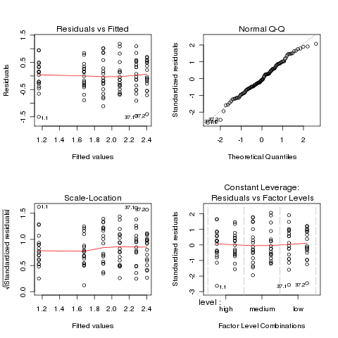
Before proceeding further, we should examine the
ANOVA plots to see if the data meets the assumptions of ANOVA:
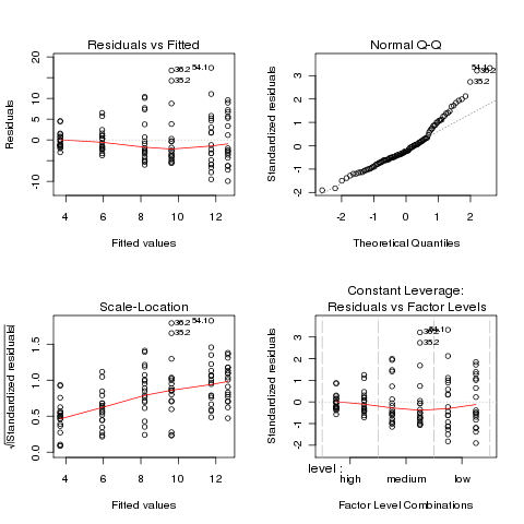 Both the normal Q-Q plot and the scale-location plot indicate
problems similar to the previous example, and a log transformation
is once again suggested. This is not unusual when data is
measured as percentages or ratios.
Both the normal Q-Q plot and the scale-location plot indicate
problems similar to the previous example, and a log transformation
is once again suggested. This is not unusual when data is
measured as percentages or ratios.
> ironl.aov = aov(log(retention) ~ level*treatment,data=iron)
> par(mfrow=c(2,2))
> plot(ironl.aov)
 The plots look much better, so we'll continue with the analysis
of the log of retention.
The plots look much better, so we'll continue with the analysis
of the log of retention.
                 Df Sum Sq Mean Sq F value   Pr(>F)
level             2 15.588   7.794 22.5241 7.91e-09 ***
treatment         1  2.074   2.074  5.9931  0.01607 *
level:treatment   2  0.810   0.405  1.1708  0.31426
Residuals       102 35.296   0.346
---
Signif. codes:  0 ‘***’ 0.001 ‘**’ 0.01 ‘*’ 0.05 ‘.’ 0.1 ‘ ’ 1
Since there were only two levels of treatment, the significant
treatment effect means the two treatments were different. We can use the
TukeyHSD function to see if the different levels of the treatment
were different:
> TukeyHSD(ironl.aov,'level')
  Tukey multiple comparisons of means
    95% family-wise confidence level

Fit: aov(formula = log(retention) ~ level * treatment, data = iron)

$level
                 diff        lwr       upr     p adj
medium-high 0.5751084 0.24533774 0.9048791 0.0002042
low-high    0.9211588 0.59138806 1.2509295 0.0000000
low-medium  0.3460503 0.01627962 0.6758210 0.0373939
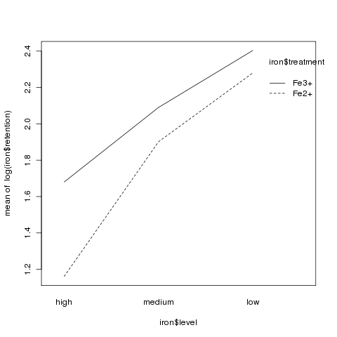
It appears that the high level had much lower retention values
than the other two levels:
> aggregate(log(iron$retention),iron['level'],mean)
   level        x
1   high 1.420526
2 medium 1.995635
3    low 2.341685
Although there was no significant interaction, an interaction plot
can still be useful in visualizing what happens in an experiment:
> interaction.plot(iron$level,iron$treatment,log(iron$retention))
File translated from
TEX
by
TTH,
version 3.67.
On 30 Apr 2010, 13:19.