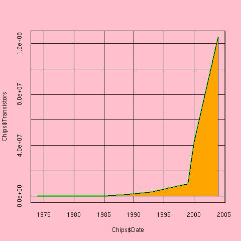
 This plot is bad for several reasons --
-
The color is too prominent and adds no meaning to the information
presented.
-
There are no references, markers, or labels.
-
Given our resources, it is data poor
-
The scale is such that the last year or two of information
dominates the others and it's difficult gain any insight beyond
the giant leap in recent years.
# Set the background to pink and
# Save the old parameter settings

oldpar = par(bg="pink")


# Make a line plot of the number of transistors by date
# The type of plot is "line", the line width is 3, and its color is green.
# The tck parameter set to 1 puts a grid on the data region
# The ylim parameter was used to include 0 on the y-axis

plot(Chips$Date,Chips$Transistors,type="l",lwd=3,
      col="green",tck=1,ylim=c(0,max(Transistors)))

# fill in the space below the line with red
polygon(c(Chips$Date,rev(Chips$Date)),c(rep(0,10),
          rev(Chips$Transistors)),col="orange")
We had to work hard to get such a bad plot.
The default values for plotting arguments in R
do a pretty good job, but we are still left
with the decision of how to scale the y axis.
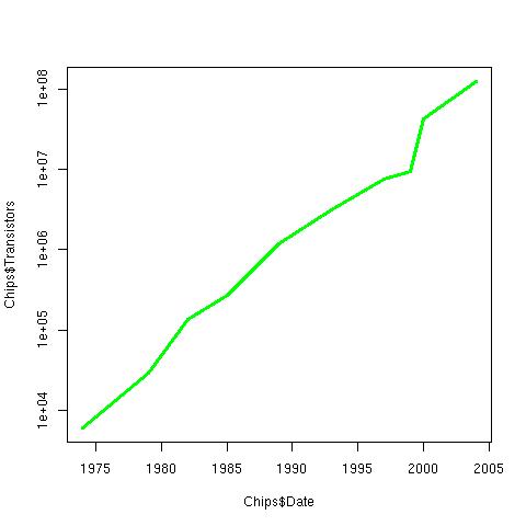
#restore the old setting of par
par(oldpar)

# Make a line plot of the number of transistors by date
plot(Chips$Date,Chips$Transistors,type="l",lwd=3,col="green",log="y")
The above plot is a far simpler, cleaner plot on a log-scale.
But there is plenty of room for inmprovement.
-
We have much more information that we could
be including in the data region of the plot.
We superpose four curves on the plot.
-
Again, we use a log scale in order to see the
change over time more clearly. Since the variables
all have different scales, we show these changes relative to
the first year, 1975.
With this change, all variables use the same y-axis,
relative change.
-
With many varaibles on the same plot, we use color to
easily differentiate them. If color were not available,
then we would use different line types, e.g. dashed,
dotted, and dash-dot.
-
A legend helps us keep track of these different
variables.
-
In addition, we can add more informative labels
to the axes.
-
We also add a titles.
- Two significant dates in chip making history
are when the 32-bit processor was introduced
and when the Pentium chip was introduced.
We can add markers to the graph indicating
these important events.
We use light gray to not dominate the data region and
distract from the main variables.
- In addition, marker labels, located out of
the main data region near the margins, help the
reader understand that these lines denote
important technological advances.
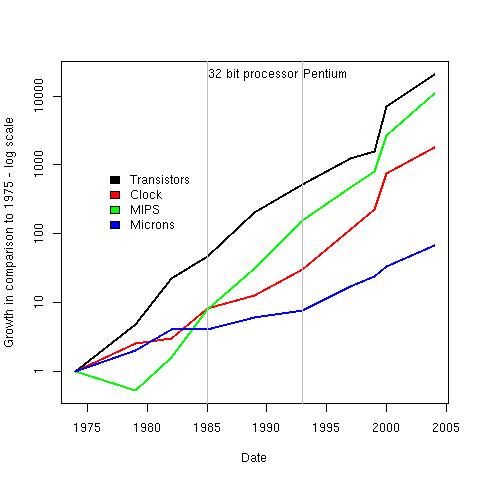
 ylab = "Growth in comparison to 1975 - log scale"
 xlab = "Date"
 coll = c("black","red","green","blue")
 varl = c("Transistors","Microns","MIPS","Clock speed")

# Superpose the lines on one plot, use colors to distinguish them
# Use a log scale again, and look at the changes relative to 1975
# so that all variables use the same y-axis

ChipsN = Chips[-5]
ChipsN = as.data.frame(lappy(ChipsN[-1], function(x) x/x[1]))

 matplot(Chips$Date,cbind(ChipsN[c(1,3,5)], 1/ChipsN[2]),
       type="l", log="y", lwd=2, lty=1, ylab=ylab, xlab=xlab, col=coll)

# Include a legend that distinguishes the various measures
 legend(1976, 1000, legend=varl, fill=coll, bty="n")

# Add marker lines to denote important technological advances
# Use a pale color so the markers do not dominate the data region
 abline(v=1993, col="grey")
 abline(v=1985, col="grey")

# Label the marker lines
 mtext(text="Pentium", side=3, line=-1.2, at=1993+0.1, adj=0)
 mtext(text="32 bit processor", side=3, line=-1.2, at=1985+0.1, adj=0)