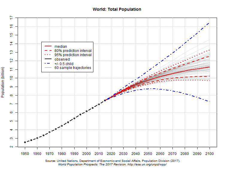
One solution is to combine the different predictions into a single probability distribution.
The example below, from 2017, shows future world population projections obtained in that way.
I want to contrast this with a second example.
Since 2012, about four times a year the U.S. Federal Open Market Committee members make predictions about where the
federal-funds rate will be at the ends of the next several years. These predictions are
released in the form of "dot-plots" like the one below.
Each dot represents one member's prediction for the end of each year.
These dots were plotted in September 2015.
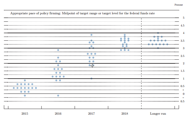
But this is a truly bad way to request and display the information. The dots show each individual's median estimate; but it seems likely that the uncertainty in each individual estimate is as large as the variability amongst these medians. The "spread" of dots in the figure is liable to be mis-interpreted as showing the probability distribution for the federal-funds rate, whereas in fact the variability must be considerably larger than shown. And in fact it was 0.55 at the end of 2016, outside the range of dots.