Smoothers
1 Supersmoother
While most smoothers require specification of a bandwidth, fraction of data, or level
of smoothing, supersmoother is different in that it figures these things out for
itself. Thus, it's an excellent choice for situations where smoothing needs to be done
without any user intervention. Supersmoother works by performing lots of simple
local regression smooths, and, at each x-value it uses those smooths to decide the best
y-value to use. In R, supersmoother is made available through the supsmu
function.
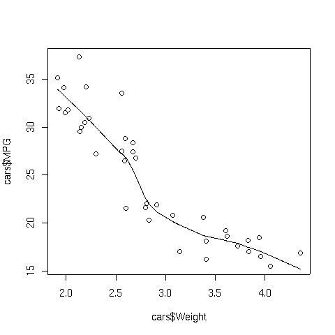
To illustrate, consider the car data which we used earlier when we were studying
cluster analysis. The following lines produce a plot of weight
versus MPG, and superimposes a supersmoother line.
> plot(cars$Weight,cars$MPG)
> lines(supsmu(cars$Weight,cars$MPG))
The plot appears below:
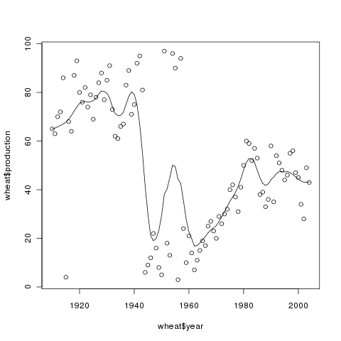
 As another example, we can revisit the wheat data that we used earlier with
spline smoothing:
As another example, we can revisit the wheat data that we used earlier with
spline smoothing:
> plot(wheat$year,wheat$production)
> lines(supsmu(wheat$year,wheat$production))
Here's the plot:
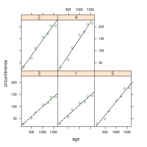
2 Smoothers with Lattice Plots
When working with lattice graphics, we've already seen the use of panel.lmline,
which displays the best regression line in each panel of a lattice plot. A similar
function, panel.loess, is available to superimpose a locally weighted regression
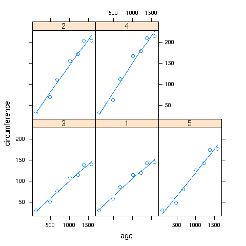
smoother in each panel of a plot. As a simple illustration, consider the built-in
Orange data set, which has information about the age and circumference of
several orange trees. First, let's look at a plot with the best regression line
smoother superimposed on the plot of age versus circumference for
each Tree:
> library(lattice)
> xyplot(circumference~age|Tree,data=Orange,
+        panel=function(x,y,...){panel.xyplot(x,y,...);panel.lmline(x,y,...)})
Here's the plot:
 To create the same plot, but using the panel.loess function, we can use
the following:
To create the same plot, but using the panel.loess function, we can use
the following:
> xyplot(circumference~age|Tree,data=Orange,
+        panel=function(x,y,...){panel.xyplot(x,y,...);panel.loess(x,y,...)})
Here's how the plot looks:
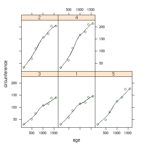 If a panel. function doesn't exist for a smoother you'd like to use,
you can use the panel.lines function to plot it directly:
If a panel. function doesn't exist for a smoother you'd like to use,
you can use the panel.lines function to plot it directly:
> xyplot(circumference~age|Tree,data=Orange,
+        panel=function(x,y,...){panel.xyplot(x,y,...);z=supsmu(x,y);panel.lines(z$x,z$y,...)})
In this case supersmoother came closer to a straight line than lowess.
File translated from
TEX
by
TTH,
version 3.67.
On 21 Apr 2010, 11:00.