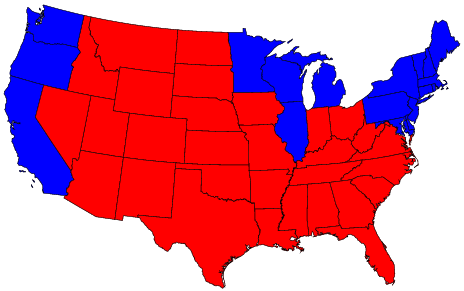
The ability to display geographically oriented data on maps is an indispensable tool for statisticians. Election results are one example of such data, for votes are tallied according to political boundaries. Well known to all of us is the map that displays the results of the 2004 US presidential election where each state is colored red for Republican or blue for Democrat according to whether Bush or Kerry received the most votes in the state.
Such an all-or-nothing approach to the election can be informative. For example, the electoral college system is set up such that if a candidate wins the popular vote in the state then he receives all of the electoral college votes for that state. A red-blue state map by Gastner, Shalizi, and Newman at the University of Michigan clearly conveys the winner in each state. The addition, as markers, of the number of electoral votes in the state would be helpful here.
This map gives the false impression that about 3/4 of the country voted Republican because land area does not accurately represent population. The red states cover far more geographic area than the blue ones, but they have smaller populations than the blue states. In other words, the blue states are small in area but large in terms of voters. Across the United States, Bush received approximately 62 million votes (51%) in the election, Kerry received about 59 million (48%) and Nader 400,000 (1%), a far cry from the red-blue land area comparison.
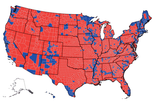
The distortion is even more pronounced when looking at county-level vote returns. The colored maps shown below fills the county region with a color to indicate how the people of the county voted, and unfortunately the counties with lower population densities are over-represented in these maps.
The difficulty that arises with adding population information to geographic maps pertains to the uneven population density in the region.
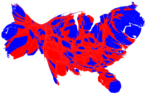
Cartograms reshape the map while maintaining geographic boundaries, so the regions are proportional to the variable of interest, which is population in our case. This is a hot research topic, and many statisticians, cartographers, physicists, etc. have turned their attention to the problem of constructing cartograms of the 2004 presidential election results.
Physicists, Gastner, Shalizi, and Newman , at the University of Michigan, uses the linear diffusion process of elementary physics in order to create a map where the geographic boundaries are distorted to represent population. According to Gasterner and Newman, in their article in Proceedings of the National Academy of Science ,
to create a cartogram, given a particular population density, is to allow population somehow to "flow away" from high-density areas into low-density ones, until the density is equalized everywhere.
Another article on their technique appeared in Science News.
As another example, Suresh Venkatasubramanian of AT&T presents such a cartogram using a "divergent bivariate color scheme generated from Cindy Brewer's beautiful ColorBrewer site." Can you find California on the map?
A simpler approach, maintains information about the size of the county or state population along with the geographic information. To do this, circles can be drawn at the center of each state or county where the area of the circle is proportional to the votes for Bush/Kerry. The New York Times produced such a plot.

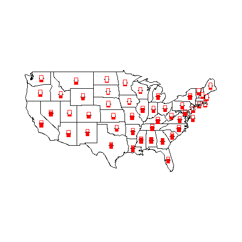
Additional information can be added to plots in several ways. For example, markers for cities can be added to indicate high density regions. Or, thermometers can be used to indicate the level of a certain variable in the region of interest. Below is a plot with thermometers that indicate the murder rates for the states.
But it is difficulty to add more than two or three variables to a map.
In the maps seen so far, the percentage of votes for Bush in a county in the 2004 presidential election are converted to the categorical information as to whether Bush won or lost the vote in the county. A county is colored red for a Bush win and blue for a Bush loss (Kerry win). What information loss is there?
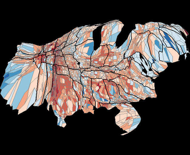
However, with these two maps we can't tell if Bush won by a landslide, if the election was close, or if he lost by a landslide in the counties and states (respectively). That is, we have lost the information as to how close the election was in the county or state. Robert Vanderbei at Princeton University suggests using shades of purple to indicate the percentages of votes cast for Bush versus Kerry. His map appears below,
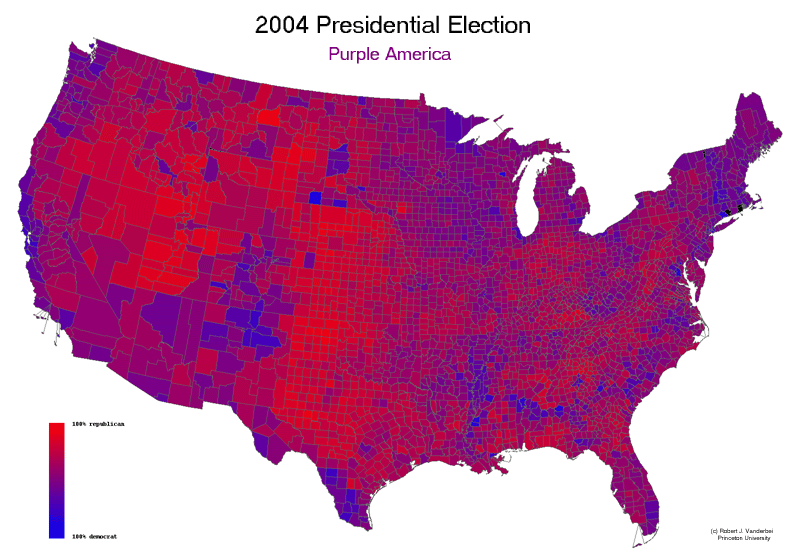
Further, in many states the election was quite close. In Iowa Bush received 50% of the vote compared to 49% for Kerry; in Ohio the split was 51% (Bush) to 49%; and in Pennsylvania it was 51% Kerry for to 49% for Bush. Where a state lands on the continuum from 0 to 100\% voting Republican is not apparent in the map. The vote in Ohio's closely contested race looks no different than the vote in North Dakota, where Bush's support was 63\%. In terms of electoral college votes these distinctions make little difference because the candidate who wins the popular vote takes all of the electoral college votes for that state, but the additional information is helpful for a more in-depth assessment of the popular vote. \end{itemize} We get a much different impression of the voting patterns of Americans from this map. However, one drawback with the use of purple that has been pointed out at http://homepage.mac.com/tcp/PurpleAmerica/
Red shades tend to stand out more to the human eye than blue shades of the same saturation. As such a blended or "purple" map of the US, based on the popular vote will tend to look a little more red than blue in its hue, given the bias of the human eye.
Colors can be specified in R several different ways. The simplest way is with a character string giving the color name (e.g., "red"). A list of the possible colors can be obtained with the function colors. Alternatively, colors can be specified directly in terms of their RGB components with a string of the form "#RRGGBB" where each of the pairs RR, GG, BB consist of two hexadecimal digits giving a value in the range 00 to FF. Colors can also be specified by giving an index into a small table of colors, the palette. Index 0 corresponds to the background color.Additionally, "transparent" or (integer) NA is transparent, useful for filled areas (such as the background!), and just invisible for things like lines or text.
The functions rgb, hsv, gray and rainbow provide additional ways of generating colors.