Classification Analysis
In R, linear discriminant analysis is provided by the lda function from the
MASS library, which is part of the base R distribution.
Like many modeling and analysis functions in R, lda takes a formula as its
first argument. A formula in R is a way of describing a set of relationships that
are being studied. The dependent variable, or the variable to be predicted, is
put on the left hand side of a tilda (~) and the variables that will be used
to model or predict it are placed on the right hand side of the tilda, joined together
by plus signs (+). To save typing, you an provide the name of a data frame
through the data= argument, and use the name of the variables in the data
frame in your formula without retyping the data frame name or using the with
function.
A convenience offered by the modeling functions is that a period (.)
on the right-hand side of the tilda in a formula is interpreted as meaning "all the
other variables in the data frame, except the dependent variable". So a very popular
method of specifying a formula is to use the period, and then use subscripting to
limit the data= argument to just the variables you want to fit. In this
example, we don't need to do that, because we really do want to use all the variables
in the data set.
> wine.lda = lda(Cultivar ~ .,data=wine)
We'll see that most of the modeling functions in R share many things in common. For
example, to predict values based on a model, we pass the model object to the
predict function along with a data frame containing the observations
for which we want predictions:
> pred = predict(wine.lda,wine)
To see what's available from the call to predict, we can look at the names of the
pred object:
> names(pred)
[1] "class"     "posterior" "x"
The predicted classification is stored in the class component of the
object returned by predict
Now that we've got the predicted classes, we can see how well the classification
went by making a cross-tabulation of the real Cultivar with our prediction, using
the table function:
> table(wine$Cultivar,pred$class)
   predclass
     1  2  3
  1 59  0  0
  2  0 71  0
  3  0  0 48
Before we get too excited about these results, remember the caution about predicting
values based on models that were built using those values. The error rate we see in
the table (0) is probably an overestimate of how good the classification rule is.
We can use v-fold cross validation on the data, by using the lda command
repeatedly to classify groups of observations (folds) using the rest of the data
to build the model.
We could write this out "by hand", but it would be useful
to have a function that could do this for us. Here's such a function:
vlda = function(v,formula,data,cl){
   require(MASS)
   grps = cut(1:nrow(data),v,labels=FALSE)[sample(1:nrow(data))]
   pred = lapply(1:v,function(i,formula,data){
	    omit = which(grps == i)
	    z = lda(formula,data=data[-omit,])
            predict(z,data[omit,])
	    },formula,data)

   wh = unlist(lapply(pred,function(pp)pp$class))
   table(wh,cl[order(grps)])
}
This function accepts four arguments: v, the number of folds in the cross
classification, formula which is the formula used in the linear discriminant
analysis, data which is the data frame to use, and cl,
the classification variable (wine$Cultivar in this case).
By using the sample function, we make sure that the groups that are used for
cross-validation aren't influenced by the ordering of the data - notice how the
classification variable (cl) is indexed by order(grps) to make sure
that the predicted and actual values line up properly.
Applying this function to the wine data will give us a better idea of the
actual error rate of the classifier:
> vlda(5,Cultivar~.,wine,wine$Cultivar)
wh   1  2  3
  1 59  1  0
  2  0 69  1
  3  0  1 47
While the error rate is still very good, it's not quite perfect:
> error = sum(tt[row(tt) != col(tt)]) / sum(tt)
> error
[1] 0.01685393
Note that because of the way we randomly divide the observations, you'll see
a slightly different table every time you run the vlda function.
We could use a similar method to apply v-fold cross-validation to the kth
nearest neighbor classification. Since the knn function accepts a
training set and a test set, we can make each fold a test set, using the
remainder of the data as a training set. Here's a function to apply this
idea:
vknn = function(v,data,cl,k){
   grps = cut(1:nrow(data),v,labels=FALSE)[sample(1:nrow(data))]
   pred = lapply(1:v,function(i,data,cl,k){
                       omit = which(grps == i)
                       pcl = knn(data[-omit,],data[omit,],cl[-omit],k=k)
                       },data,cl,k)

   wh = unlist(pred)
   table(wh,cl[order(grps)])
}
Let's apply the function to the standardized wine data:
> tt = vknn(5,wine.use,wine$Cultivar,5)
> tt

wh   1  2  3
  1 59  2  0
  2  0 66  0
  3  0  3 48
> sum(tt[row(tt) != col(tt)]) / sum(tt)
[1] 0.02808989
Note that this is the same misclassification rate as
acheived by the "leave-out-one" cross validation provided by
knn.cv.
Both the nearest neighbor and linear discriminant methods make it
possible to classify new observations, but they don't give much
insight into what variables are important in the classification.
The scaling element of the object returned by lda
shows the linear combinations of the original variables that were created
to distinguish between the groups:
>  wine.lda$scaling
                         LD1           LD2
Alcohol         -0.403399781  0.8717930699
Malic.acid       0.165254596  0.3053797325
Ash             -0.369075256  2.3458497486
Alkalinity.ash   0.154797889 -0.1463807654
Magnesium       -0.002163496 -0.0004627565
Phenols          0.618052068 -0.0322128171
Flavanoids      -1.661191235 -0.4919980543
NF.phenols      -1.495818440 -1.6309537953
Proanthocyanins  0.134092628 -0.3070875776
Color.intensity  0.355055710  0.2532306865
Hue             -0.818036073 -1.5156344987
OD.Ratio        -1.157559376  0.0511839665
Proline         -0.002691206  0.0028529846
It's really not that easy to interpret them, but variables with
large absolute values in the scalings are more likely to influence the
process. For this data, Flavanoids, NF.phenols, Ash,
and Hue seem to be among the important variables.
A different way to get some insight into this would be to examine the
means of each of the variables broken down by the classification
variable. Variables which show a large difference among the
groups would most likely be the ones that are useful in predicting
which group an observation belongs in. One graphical way of
displaying this information is with a barplot. To make sure we
can see differences for all the variables, we'll use the
standardized version of the data:
> mns = aggregate(wine.use,wine['Cultivar'],mean)
> rownames(mns) = mns$Cultivar
> mns$Cultivar = NULL
> barplot(as.matrix(mns),beside=TRUE,cex.names=.8,las=2)
The las parameter rotates the labels on
the x-axis so that we can see them all. Here's the plot:
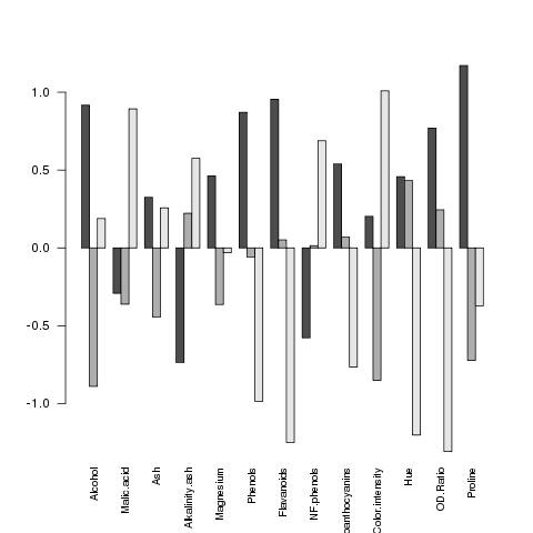 It seems like the big differences are found in Flavanoids,
Hue and OD.Ratio
Now let's take a look at a method that makes it very clear which variables
are useful in distinguishing among the groups.
It seems like the big differences are found in Flavanoids,
Hue and OD.Ratio
Now let's take a look at a method that makes it very clear which variables
are useful in distinguishing among the groups.
1 Recursive Partitioning
An alternative classification method, developed in the 1980s, has attracted a
lot of attention in a variety of different fields. The technique, known as
recursive partitioning or CART (Classification and Regression Trees), can be
use for either classification or regression - here we'll concentrate on its
use for classification. The basic idea is to examine, for each of the variables
that we're using in our classification model, the results of splitting the data
set based on one of the values of that variable, and then examining how that
split helps us distinguish between the different classes of interest. For example,
suppose we're using just one variable to help distinguish between two classes:
> mydata = data.frame(x=c(7,12,8,3,4,9,2,19),grp=c(1,2,1,1,1,2,2,2))
> mydata
   x grp
1  7   1
2 12   2
3  8   1
4  3   1
5  4   1
6  9   2
7  2   2
8 19   2
We'd consider each value of x in the data, and split the data into two
groups: one where x was less than or equal to the value and the other where
x
is greater than the value. We then look at how our classification variable (grp
in this example) breaks down when the data is split this way. For this example, we
can look at all the possible cross-tabulations:
> tbls = sapply(mydata$x,function(val)table(mydata$x <= val,mydata$grp))
> names(tbls) = mydata$x
> tbls
> tbls
$"7"

        1 2
  FALSE 1 3
  TRUE  3 1

$"12"

        1 2
  FALSE 0 1
  TRUE  4 3

$"8"

        1 2
  FALSE 0 3
  TRUE  4 1

$"3"

        1 2
  FALSE 3 3
  TRUE  1 1

$"4"

        1 2
  FALSE 2 3
  TRUE  2 1

$"9"

        1 2
  FALSE 0 2
  TRUE  4 2

$"2"

        1 2
  FALSE 4 3
  TRUE  0 1

$"19"

       1 2
  TRUE 4 4
If you look at each of these tables, you can see that when we split with the rule
x <= 8, we get the best separation; all three of the cases where
x is greater than
8 are classified as 2, and four out of five of the cases where x is less than
8 are classified as 1.
For this phase of a recursive partitioning, the rule x <= 8 would be
chosen to split the data.
In real life situations, where there will always be more than one variable, the
process would be repeated for each of the variables, and the chosen split would
the one from among all the variables that resulted in the best separation or
node purity as it is sometimes known. Now that we've found the single best split,
our data is divided into two groups based on that split. Here's where the recursive
part comes in: we keep doing the same thing to each side of the split data, searching
through all values of all variables until we find the one that gives us the best
separation, splitting the data by that value and then continuing. As implemented in
R through the rpart function in the rpart library, cross validation
is used internally to determine when we should stop splitting the data, and present a
final tree as the output. There are also options to the rpart function specifying the
minimum number of observations allowed in a split, the minimum number of observations
allowed in one of the final nodes and the maximum number of splits allowed, which can
be set through the control= argument to rpart. See the help page
for rpart.control for more information.
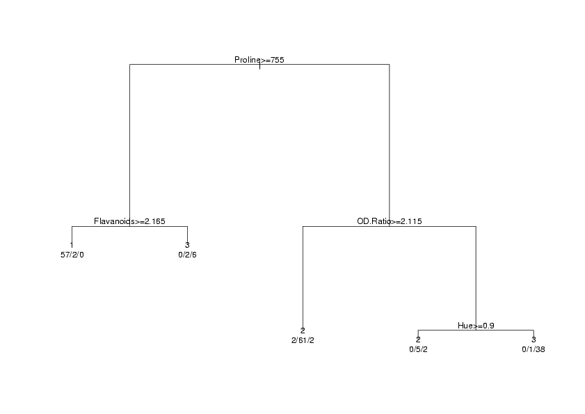
To show how information from recursive partitioning is displayed, we'll use the same data
that we used with lda. Here are the commands to run the analysis:
> library(rpart)
> wine.rpart = rpart(Cultivar~.,data=wine)
> wine.rpart
n= 178

node), split, n, loss, yval, (yprob)
      * denotes terminal node

 1) root 178 107 2 (0.33146067 0.39887640 0.26966292)
   2) Proline>=755 67  10 1 (0.85074627 0.05970149 0.08955224)
     4) Flavanoids>=2.165 59   2 1 (0.96610169 0.03389831 0.00000000) *
     5) Flavanoids< 2.165 8   2 3 (0.00000000 0.25000000 0.75000000) *
   3) Proline< 755 111  44 2 (0.01801802 0.60360360 0.37837838)
     6) OD.Ratio>=2.115 65   4 2 (0.03076923 0.93846154 0.03076923) *
     7) OD.Ratio< 2.115 46   6 3 (0.00000000 0.13043478 0.86956522)
      14) Hue>=0.9 7   2 2 (0.00000000 0.71428571 0.28571429) *
      15) Hue< 0.9 39   1 3 (0.00000000 0.02564103 0.97435897) *
The display always starts at the root (all of the data), and reports the splits in the order
they occured. So after examining all possible values of all the variables, rpart
found that the Proline variable did the best job of dividing up the observations into
the different cultivars; in particular of the 67 observations for which Proline
was greater than 755, the fraction that had Cultivar == 1 was .8507. Since there's
no asterisk after that line, it indicates that rpart could do a better job by considering
other variables. In particular if Proline was >= 755, and Flavanoids
was >= 2.165, the fraction of Cultivar 1 increases to .9666; the asterisk at the end of a line
indicates that this is a terminal node, and, when classifying an observation if Proline
was >= 755 and Flavanoids was >= 2.165, rpart would immediately assign it to
Cultivar 1 without having to consider any other variables. The rest of the output can be determined
in a similar fashion.
An alternative way of viewing the output from rpart is a tree diagram, available through
the plot function. In order to identify the parts of the diagram, the text function
also needs to be called.
> plot(wine.rpart)
> text(wine.rpart,use.n=TRUE,xpd=TRUE)
The xpd=TRUE is a graphics parameter that is useful when a plot gets truncated, as sometimes
happens with rpart plots. There are other options to plot and text which
will change the appearance of the output; you can find out more by looking at the help pages for
plot.rpart and text.rpart. The graph appears below.
 In order to calculate the error rate for an rpart analysis, we once again use the predict
function:
In order to calculate the error rate for an rpart analysis, we once again use the predict
function:
> pred.rpart = predict(wine.rpart,wine)
As usual we can check for names to see how to access the predicted values:
> names(pred.rpart)
NULL
Since there are no names, we'll examine the object directly:
> head(pred.rpart)
           1          2          3
1 0.96610169 0.03389831 0.00000000
2 0.96610169 0.03389831 0.00000000
3 0.96610169 0.03389831 0.00000000
4 0.96610169 0.03389831 0.00000000
5 0.03076923 0.93846154 0.03076923
6 0.96610169 0.03389831 0.00000000
All that predict returns in this case is a matrix with estimated probabilities
for each cultivar
for each observation; we'll need to find which one is highest for each observation. Doing
it for one row is easy:
> which.max(rped.rpart[1,])
1
1
To repeat this for each row, we can pass which.max to apply, with a
second argument of 1 to indicate we want to apply the function to each row:
> table(apply(pred.rpart,1,which.max),wine$Cultivar)

     1  2  3
  1 57  2  0
  2  2 66  4
  3  0  3 44
To compare this to other methods, we can again use the row and col
functions:
> sum(tt[row(tt) != col(tt)]) / sum(tt)
[1] 0.06179775
Since rpart uses cross validation internally to build its decision rules, we can
probably trust the error rates implied by the table.
File translated from
TEX
by
TTH,
version 3.85.
On 4 Apr 2011, 10:53.